


Basic Configuration
The basic configuration system provides comprehensive and detailed setting options for components. It supports personalized field name definitions, clear hint messages to guide user operations, flexible component width adjustments, an ignore toggle feature for scenario-based decisions, diverse label style settings, and component linkage functionality for collaborative interactions.
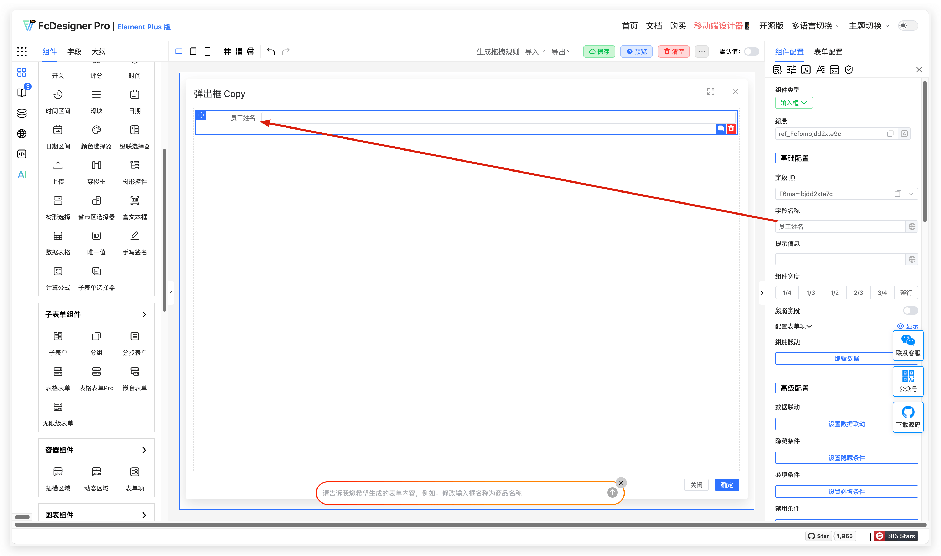
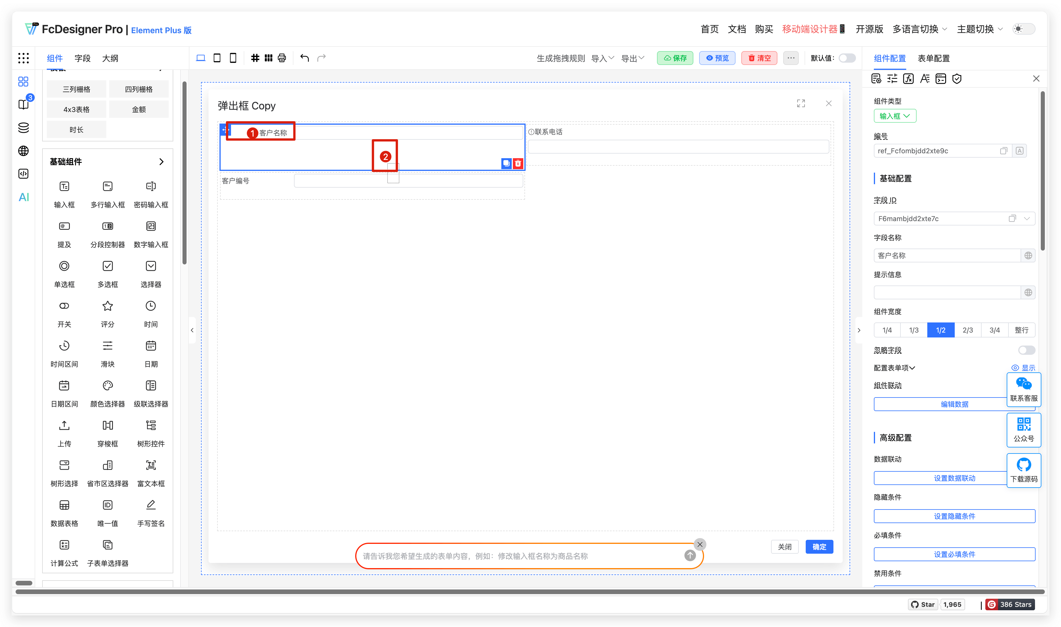
1. Field Name
1.1 Overview
A field name is a title identifier set for component input content, providing clear guidance to users and helping them accurately fill in the corresponding field content.
1.2 Use Cases
Examples include name, product name, company name, specifications, model number, etc.
1.3 Expected Result
Using employee name as an example, the result is shown below:
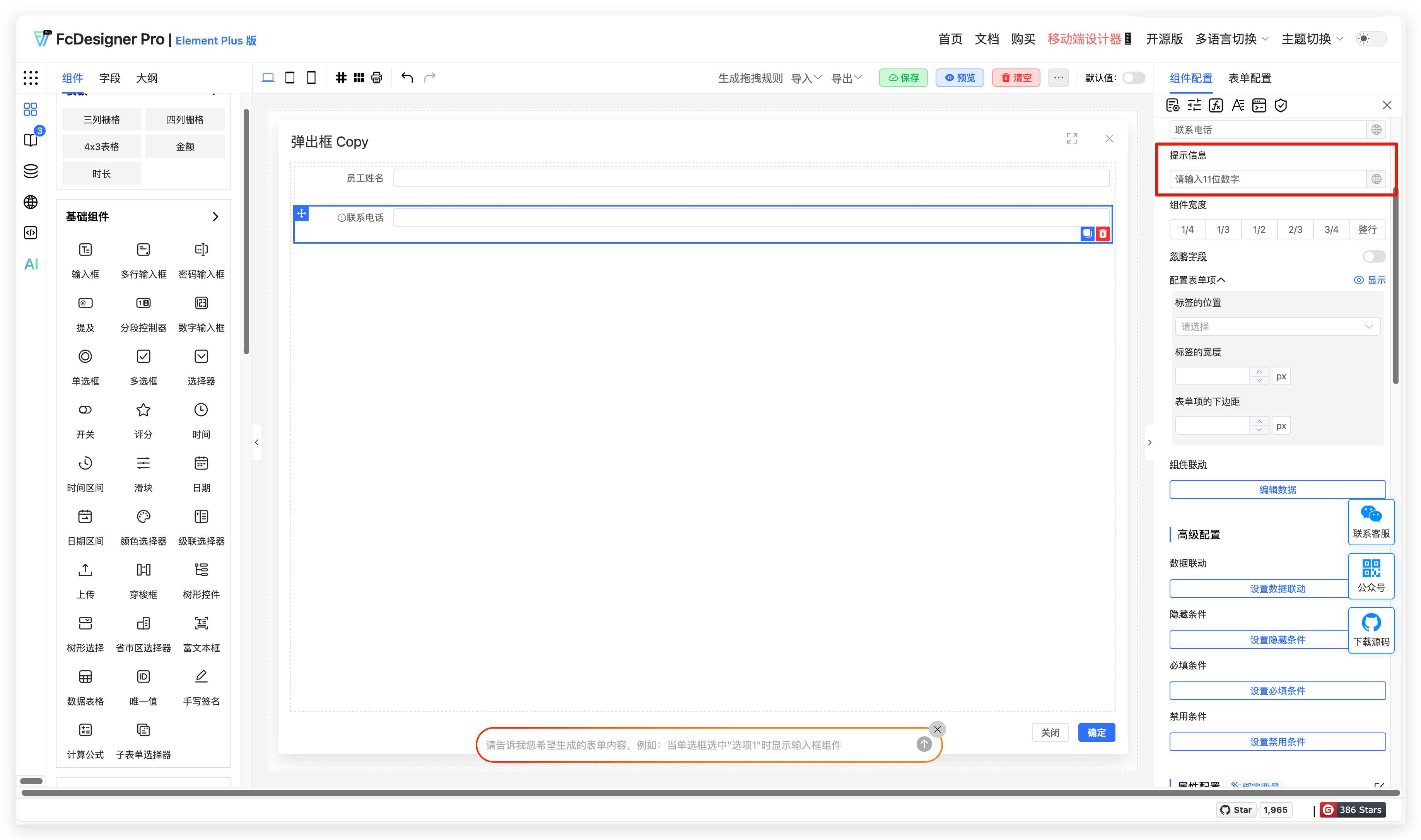
2. Hint Message
2.1 Overview
Hint text provides guidance for form input fields. It appears when the field is empty and disappears once the user starts typing. Brief hints help users quickly understand what information to enter, improving data entry efficiency.
2.2 Use Cases
In employee information collection scenarios, use hint text to indicate the number of digits for phone numbers. In customer satisfaction survey scenarios, use hint text to indicate the scoring range.
2.3 Expected Result
Using employee information collection as an example, with hint text provided at the contact phone number field, the result is shown below:
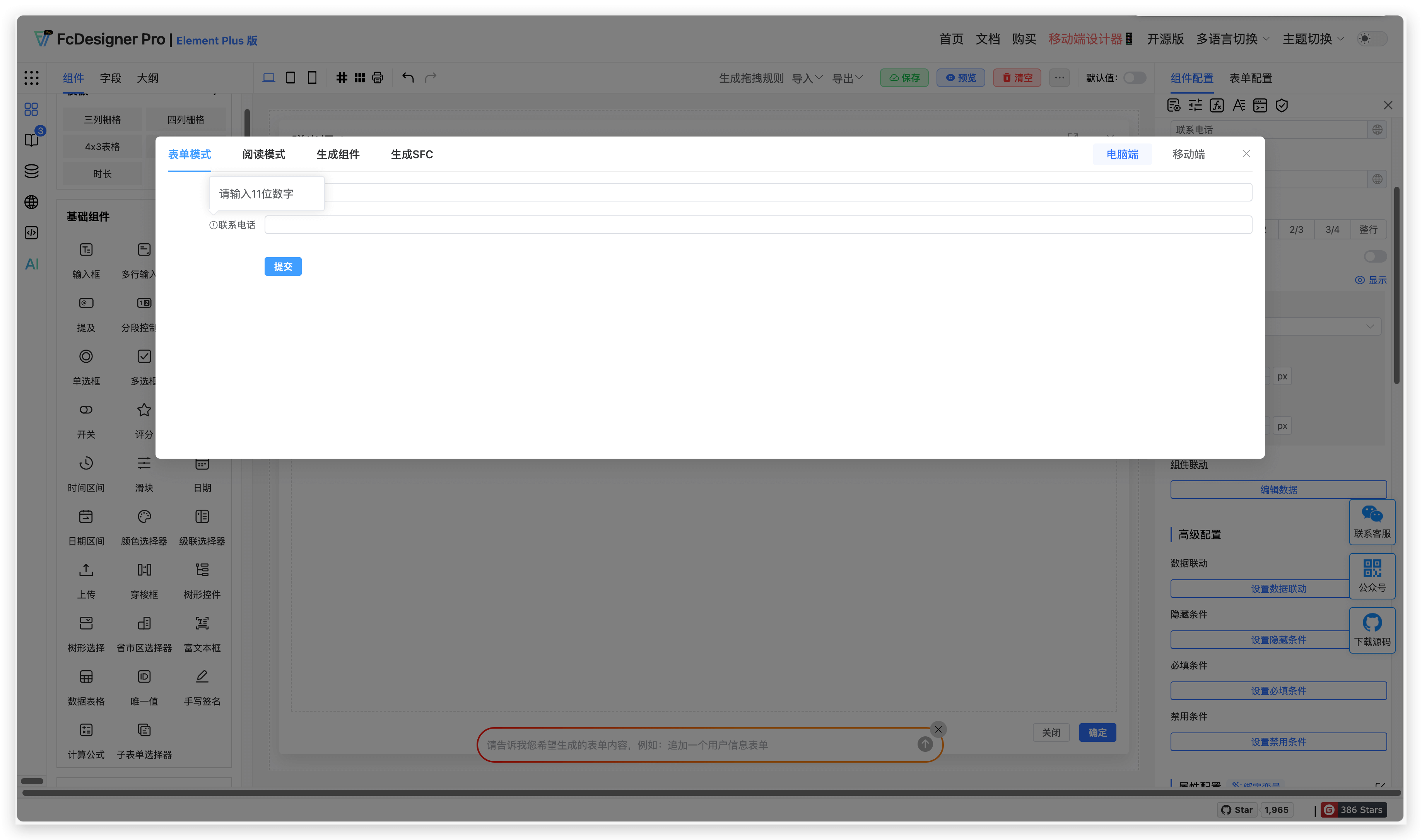
2.4 Configuration Entry
In the component editing page, select the field you want to configure, then set the hint text in the right toolbar under "Component Configuration >> Hint Message".
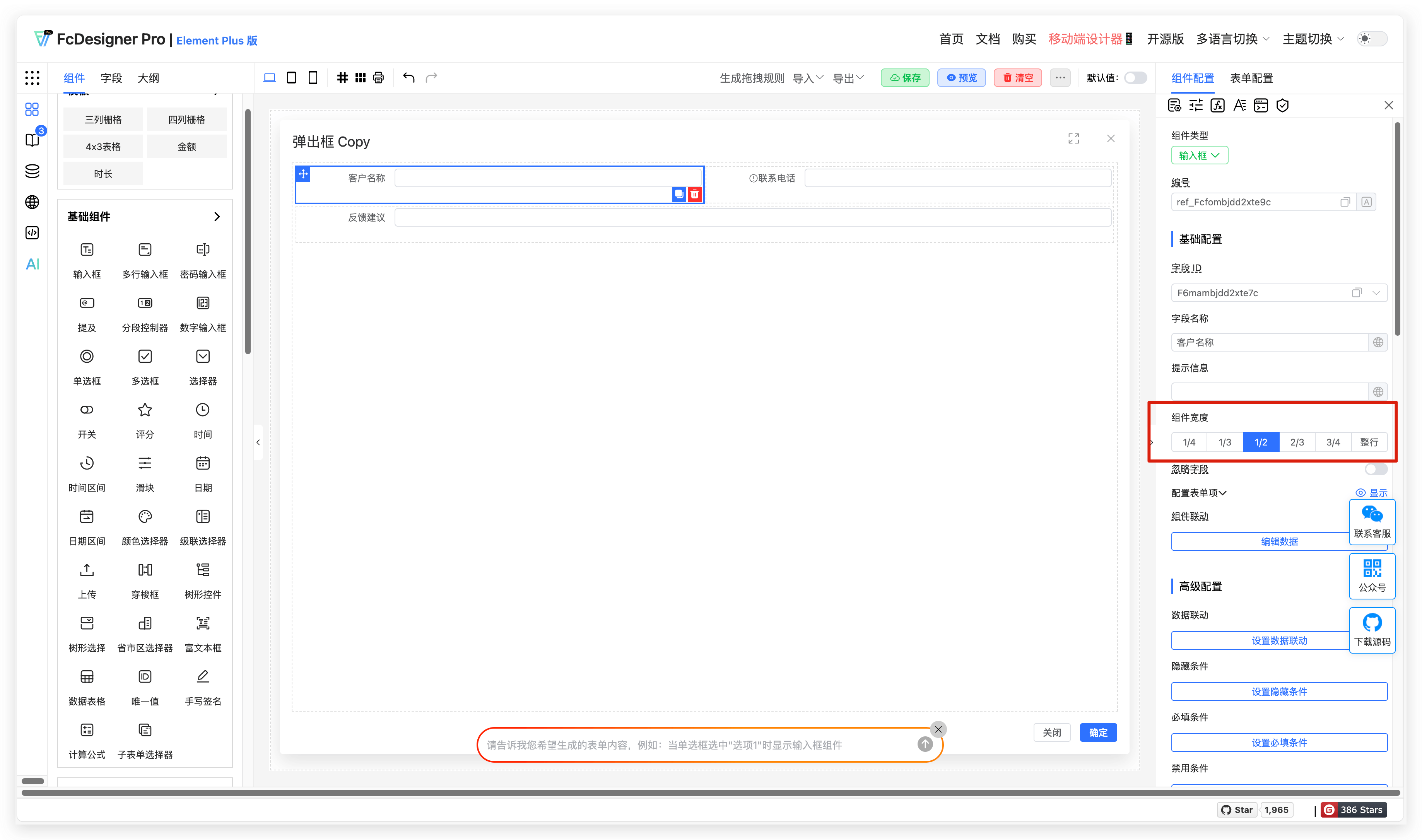
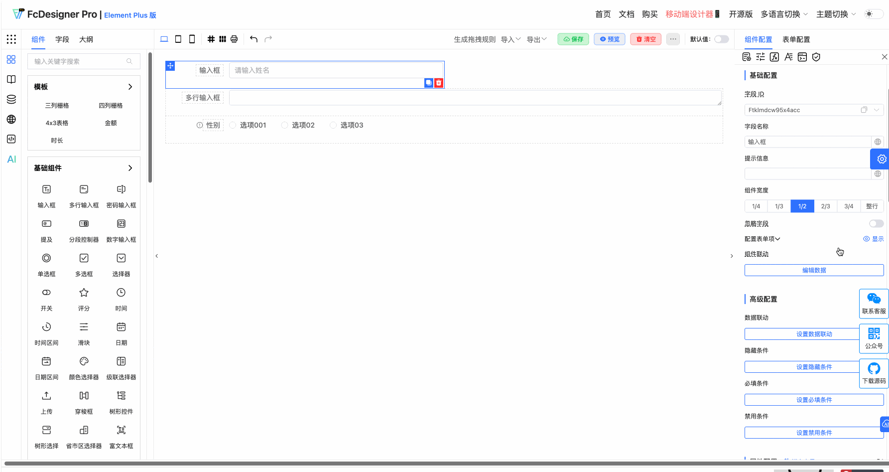
3. Component Width
3.1 Overview
Different fields require different content lengths, so the required field widths also differ. To better arrange form layouts, you can set the field width individually for specific fields.
3.2 Use Cases
In customer satisfaction survey scenarios, setting the customer feedback field width to full row allows customers to fill in more feedback content. Customer name and contact phone number are relatively short, so you can choose 1/2 width.
3.3 Expected Result
Using customer name and feedback suggestions field widths as examples, the result is shown below:
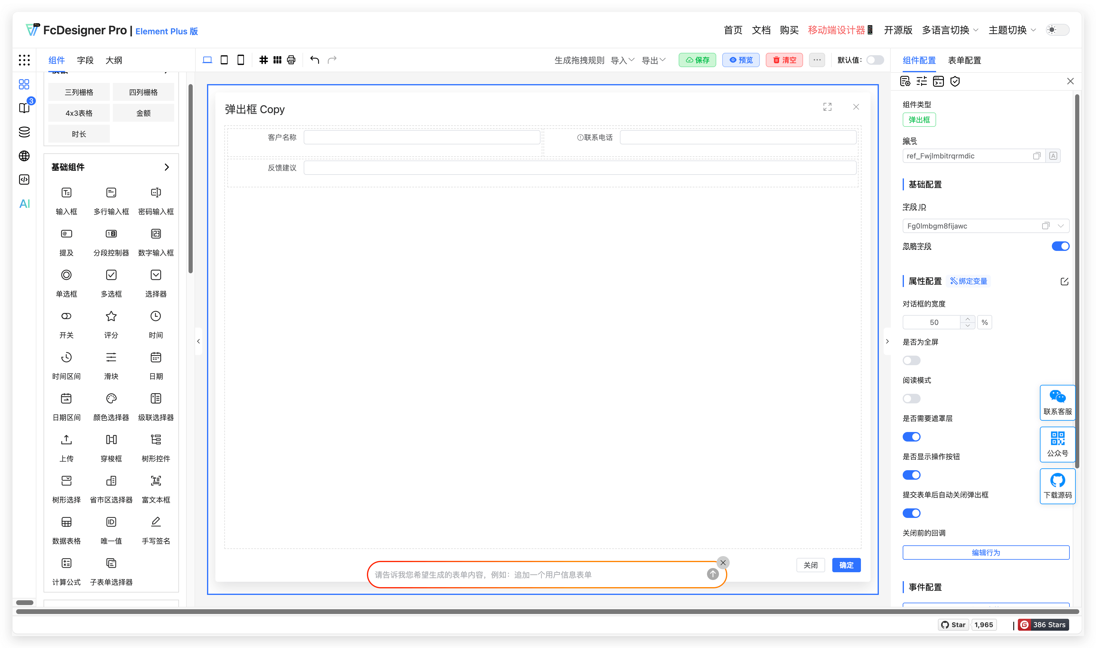
3.4 Configuration Entry
In the component editing page, select the field you want to configure, then set the component width in the right toolbar under "Component Configuration >> Component Width".
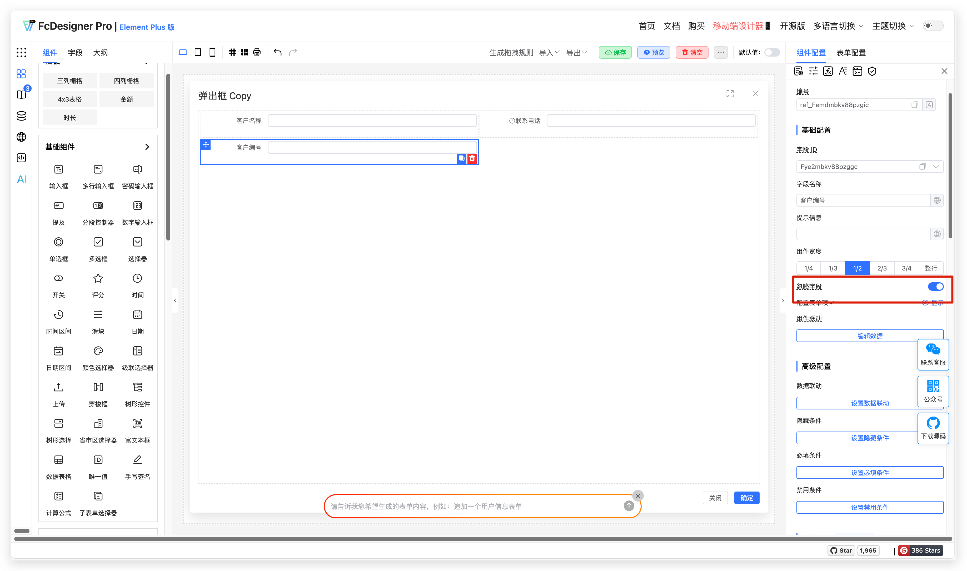
4. Ignore Field
4.1 Overview
When enabled, the form submission will automatically exclude this component's field and will not include it in the submitted data.
4.2 Use Cases
Customer numbers need to be automatically generated based on system business logic and do not require user input or submission. You can enable field hiding for this.
4.3 Configuration Entry
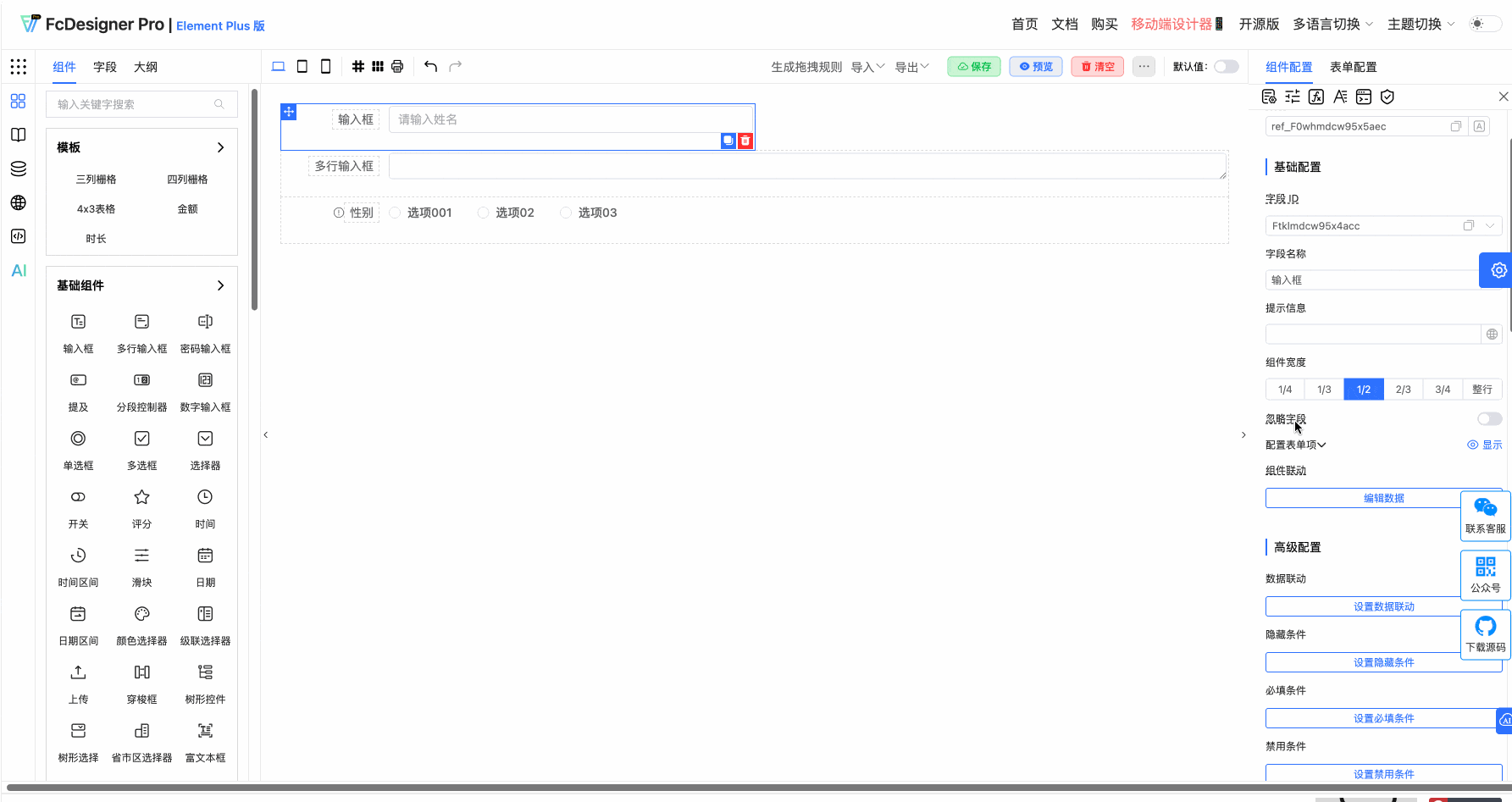
In the component editing page, select the field you want to configure, then enable the ignore field option in the right toolbar under "Component Configuration >> Ignore Field".
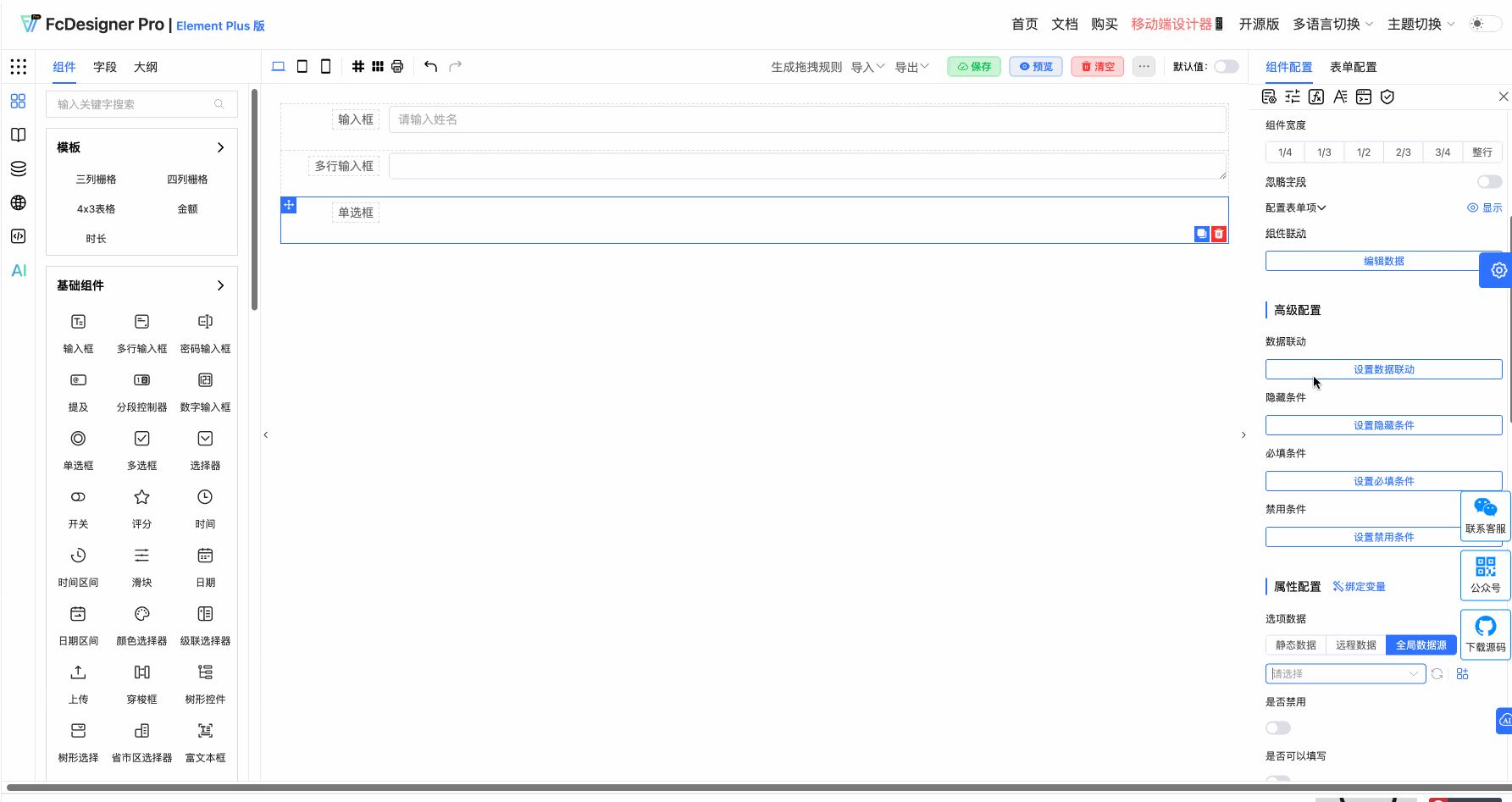
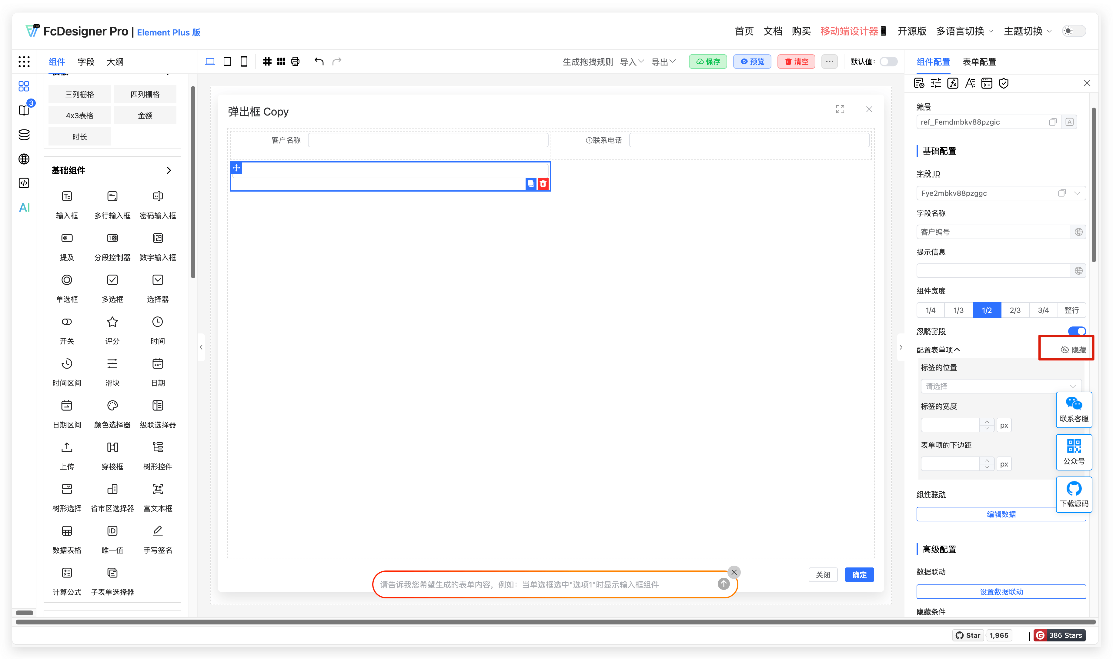
5. Hide Field Label
5.1 Overview
Some fields do not need to display field labels, and you can hide the field label for such fields.
5.2 Use Cases
Forms with less content can omit field label display.
5.3 Expected Result
Using customer number field label hiding as an example, the result is shown below:
5.4 Configuration Entry
In the component editing page, select the field you want to configure, then set field label hiding in the right toolbar under "Component Configuration >> Form Item Configuration".
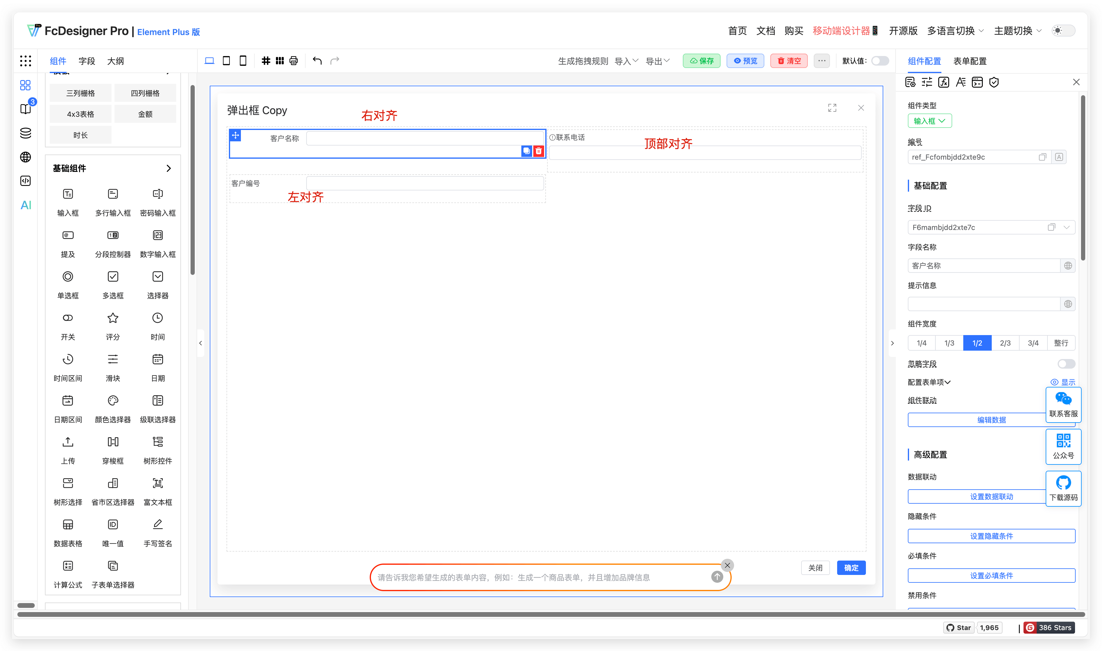
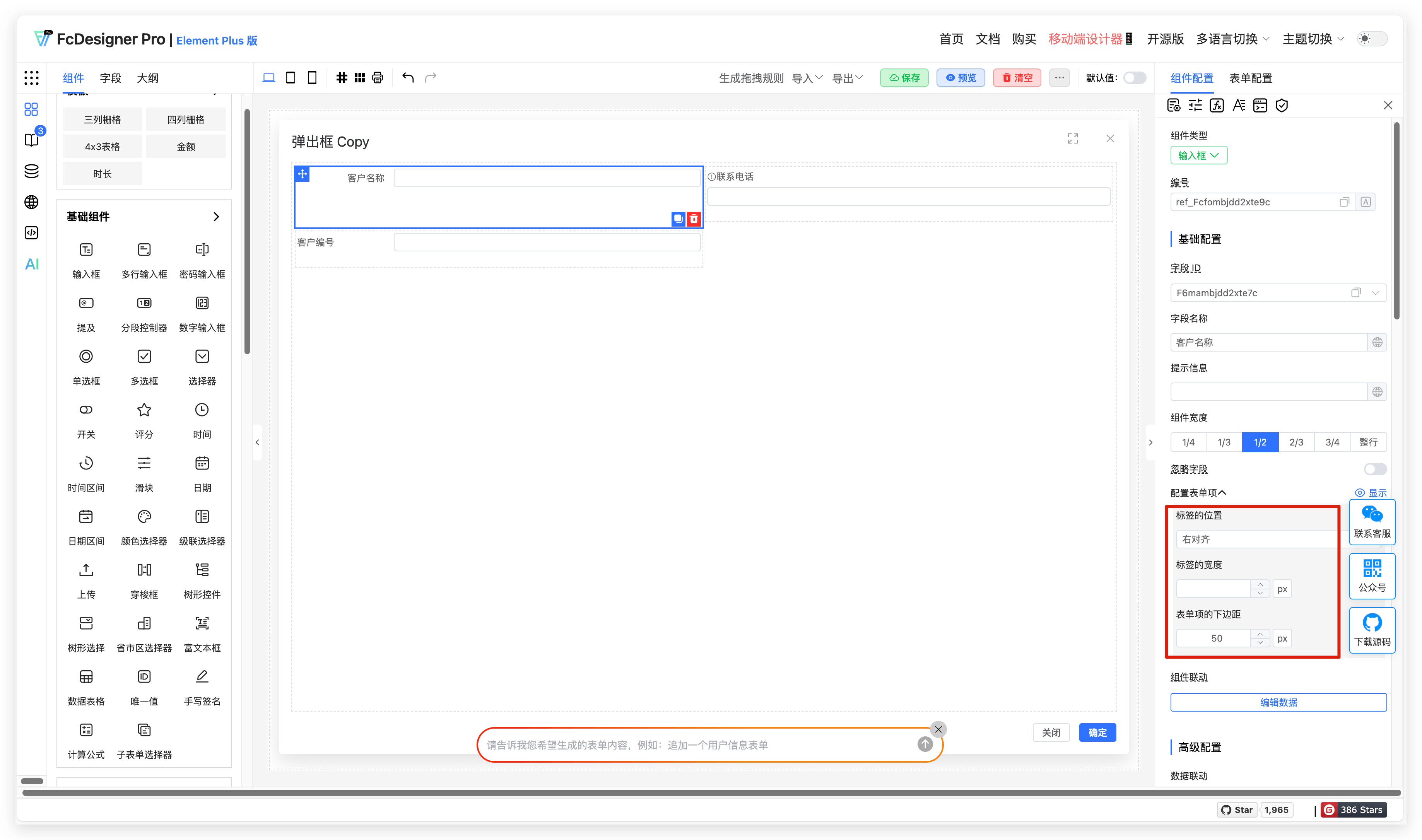
6. Form Item Configuration
6.1 Overview
Field label styles provide flexible configuration options, supporting custom label positions, label width adjustments, and bottom margin settings to meet diverse interface layout needs.
6.2 Use Cases
When designing online registration forms, for field names of different lengths (e.g., "Name" is short while "Emergency Contact Phone and Relationship" is long), adjusting the label width makes the form layout more organized. Set the label position (left-aligned or top-aligned) and bottom margin based on the form style to improve user experience.
6.3 Expected Result
The effects of different label positions are shown below:
The label width and bottom margin setting effects are shown below:
6.4 Configuration Entry

In the component editing page, select the field you want to configure, then set the field position, width, and bottom margin in the right toolbar under "Component Configuration >> Form Item Configuration".
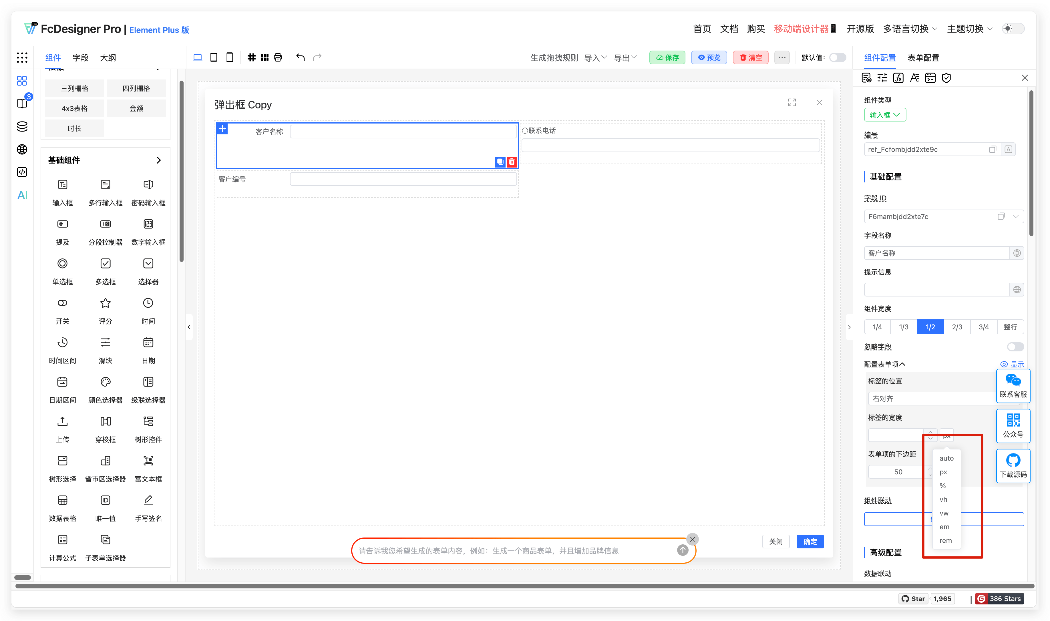
Width and margin settings support px, auto, %, vh, vw, em, rem
px: Pixel is the smallest unit displayed on the screen. px is an absolute length unit based on device pixel density
auto: Not a specific length unit, but an automatically calculated value. The browser automatically determines its size or position based on the element's layout and surrounding environment
%: A relative length unit calculated relative to the corresponding dimension of the containing block
vh: A percentage unit relative to the viewport (browser window) height. 1vh equals 1% of the viewport height
vw: A percentage unit relative to the viewport (browser window) width. 1vw equals 1% of the viewport width
em: A relative length unit calculated relative to the current element's font size. If the current element's font size is not explicitly set, it is relative to its parent element's font size
rem: Also a relative length unit, but calculated relative to the root element's (usually the <html> element) font size