


Component Overview
1. Introduction
1.1 Overview
Fields are essential elements for creating forms and core tools for data collection. Using different types of fields appropriately in forms can make the data collection process more efficient.
1.2 Component Types
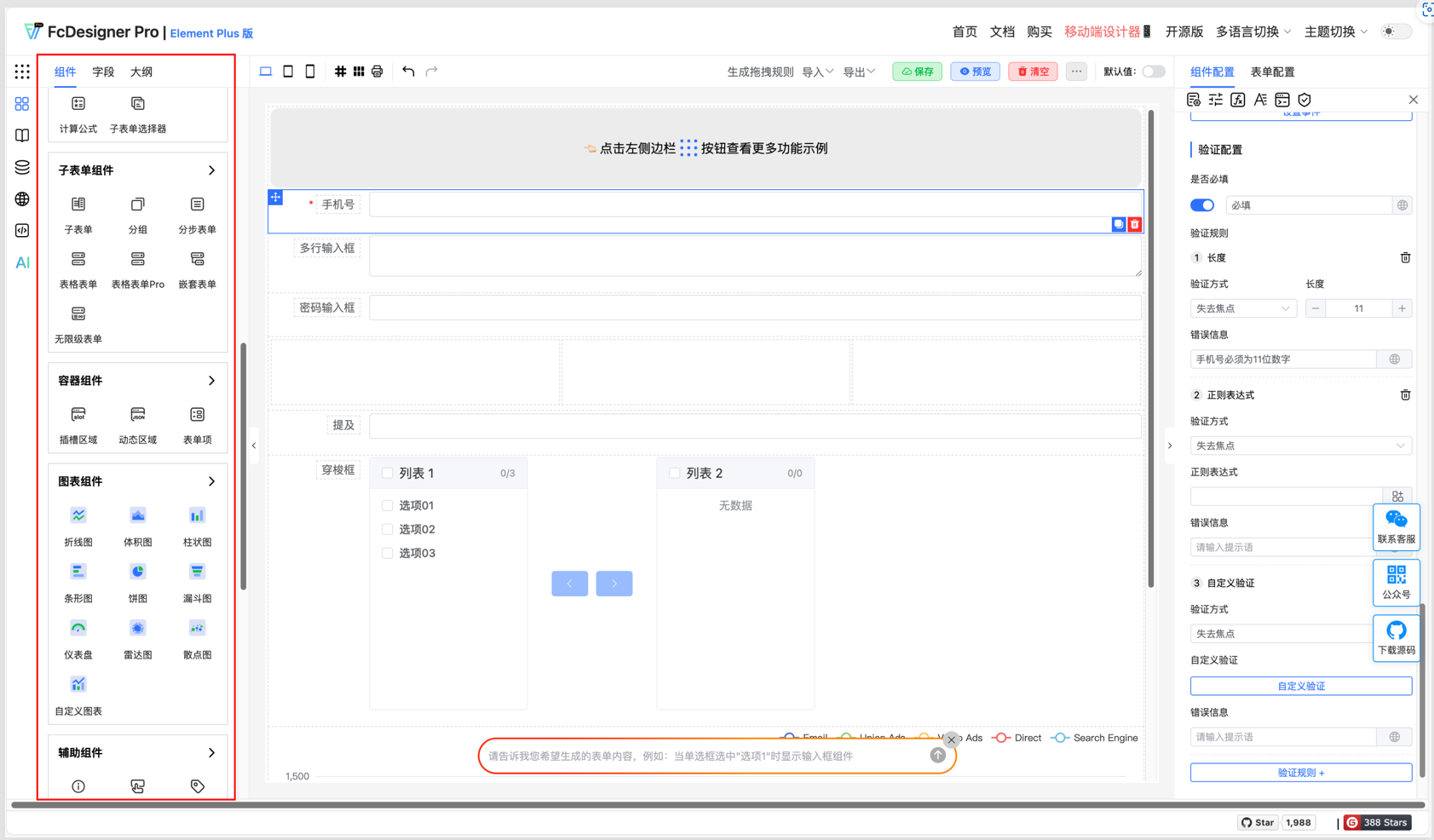
FcDesigner offers over 60 components organized into seven categories: Templates, Basic Components, Sub-form Components, Container Components, Chart Components, Auxiliary Components, and Layout Components. Choosing the right component type is crucial as it affects user experience, data collection, and data analysis.
1.2.1 Templates
Used for quickly building page layouts or form structures, reducing repetitive development.
Three-Column Grid:
Divides the page into three equal-width columns, suitable for scenarios requiring parallel display of three content sections (such as product lists, service categories).
Usage: Drag a three-column grid template into the page, then add components (such as images, titles, descriptions) in each column.
Four-Column Grid:
Divides the page into four equal-width columns, suitable for more granular content display (such as icon menus, widgets).
Usage: Similar to the three-column grid, but more suitable for scenarios requiring more parallel content.
4x3 Table:
A table with 4 rows and 3 columns for displaying structured data (such as configuration items, parameter comparisons).
Usage: Fill the table with text, numbers, or links, supporting cell merging or style adjustments.
Amount:
A template for formatted amount display, automatically showing the uppercase representation of the entered amount.
Usage: Bind to a numeric field, automatically rendered in amount format, supporting input or display.
Duration:
A template for formatted time display (such as "2 hours 30 minutes"), suitable for task duration, video length, and other scenarios.
Usage: Bind to time values (seconds or milliseconds), automatically converted to readable duration format.
1.2.2 Basic Components
Used for input and display of form fields, covering common scenarios.
Input Box:
Single-line text input, suitable for brief information (such as username, email).
Usage: Bind to a variable, supporting input validation (such as required, length limits).
Textarea:
Multi-line text input, suitable for long text (such as notes, descriptions).
Usage: Supports automatic line breaks, adaptive height, or fixed height.
Password Input:
Hides characters during input (displayed as dots), suitable for sensitive information like passwords.
Usage: Bind to a variable, supporting password strength validation.
Mention:
Supports @user or #tag during input, triggering related content (such as user lists, topic lists).
Usage: Commonly used in social platforms and comment systems, binding data sources for dynamic suggestions.
Segmented Controller:
Single-select toggle button group, suitable for scenarios with fewer options (such as gender, status).
Usage: Bind to a variable, click to toggle option values.
Number Input:
Only allows numeric input, supports decimal or integer limits, and supports setting maximum, minimum, and other boundary value constraints.
Usage: Bind to a numeric variable, supporting increment/decrement buttons or keyboard input.
Radio Button:
Single-select button, suitable for mutually exclusive options (such as agreement acceptance).
Usage: Bind to a variable, click to select the unique option.
Checkbox:
Checkbox supporting multiple selections (such as hobbies, permission selections).
Usage: Bind to an array variable, click to add or remove options.
Select:
Dropdown selection box, suitable for scenarios with more options (such as country, occupation).
Usage: Bind to a variable, supporting search, grouping, or custom options.
Switch:
Boolean toggle button (on/off), suitable for state switching (such as enable/disable).
Usage: Bind to a boolean variable, click to toggle state.
Rating:
Star rating component, suitable for user evaluations (such as product ratings).
Usage: Bind to a numeric variable, supporting half-star or integer ratings.
Time:
Select a specific time point (such as "14:30"), suitable for schedule arrangements.
Usage: Bind to a time variable, supporting 24-hour or 12-hour format.
Time Range:
Select start and end times, suitable for time period selection (such as meeting times).
Usage: Bind to two time variables, supporting linkage validation (such as end time must be later than start time).
Slider:
Drag slider to select values, suitable for range selection (such as volume adjustment, price range).
Usage: Bind to a numeric variable, supporting minimum, maximum, and step settings.
Date:
Select a specific date (such as "2023-10-01"), suitable for birthdays, deadlines, etc.
Usage: Bind to a date variable, supporting calendar view or quick selection.
Date Range:
Select start and end dates, suitable for date range selection (such as travel dates).
Usage: Bind to two date variables, supporting disabled weekends or holidays.
Color Picker:
Select color through color palette or RGB/HEX values, suitable for theme customization.
Usage: Bind to a color variable, supporting transparency adjustment.
Cascader:
Multi-level linked selection box (such as province-city-district), suitable for hierarchical data.
Usage: Bind to an array variable, supporting dynamic loading of child options.
Upload:
Upload files or images, supporting drag-and-drop, multiple selection, or preview.
Usage: Bind to a file variable, supporting file type, size, or quantity limits.
Transfer:
Left-right dual-column selector, supporting moving options from one column to another (such as permission assignment).
Usage: Bind to two array variables, supporting search, select all, or custom operations.
Tree:
Display tree-structured data (such as folders, organizational structure), supporting expand/collapse.
Usage: Bind to tree data, supporting click node to trigger events.
Tree Select:
Select nodes in tree structure (such as selecting department), supporting single or multiple selection.
Usage: Bind to a variable, supporting search, lazy loading, or custom node styles.
Province-City-District Picker:
Specifically for selecting Chinese provinces, cities, and districts, supporting linkage (such as loading cities after selecting province).
Usage: Bind to three variables (province, city, district), supporting default values or clearing.
Rich Text Editor:
Supports rich text editing (such as bold, insert images), suitable for content creation.
Usage: Bind to HTML variable, supporting toolbar customization or paste filtering.
Data Table:
Dynamically render table data, supporting pagination, sorting, or filtering.
Usage: Bind to array data, supporting custom columns, row operations, or summary rows.
Unique Value:
Validates whether input value is unique (such as username cannot be duplicated), suitable for registration forms.
Usage: Bind to a variable, asynchronously validates whether the value already exists in the data source.
Handwritten Signature:
Handwrite signature through touchscreen or mouse, suitable for contract signing.
Usage: Bind to image variable, supporting clear, save, or convert to Base64.
Calculation Formula:
Automatically calculates results based on values of other fields (such as total price = unit price × quantity).
Usage: Bind to formula expression, supporting addition, subtraction, multiplication, division, or function calls.
Sub-form Selector:
Select and embed a sub-form, suitable for modular design of complex forms.
Usage: Bind to sub-form data, supporting dynamic loading or conditional rendering.
1.2.3 Sub-form Components
Used for designing forms containing nested or repetitive structures, such as product lists, order details, etc.
Sub-form:
Allows embedding one or more sub-forms within the main form. Each sub-form can independently design fields, suitable for scenarios requiring repeated entry (such as multiple rows of product information).
Group:
Logically groups form fields to improve readability, for example, separating "Basic Information" and "Contact Information" into different groups.
Step Form:
Splits complex forms into multiple steps, allowing users to fill in progressively, reducing one-time input pressure, suitable for long forms or complex workflows.
Table Form:
Displays form fields in table format, supporting inline editing, suitable for scenarios requiring batch entry or data display.
Table Form Pro:
Enhanced table form, supporting more complex interactions (such as inline calculations, conditional rendering, dynamic row addition/deletion).
Nested Form:
Supports multi-level nested form structures, for example, a main form containing sub-forms, which in turn contain deeper sub-forms.
Infinite-Level Form:
Allows users to dynamically add unlimited levels of sub-forms, suitable for tree structures or uncertain level nesting requirements.
1.2.4 Container Components
Used for wrapping or dynamically controlling the display and layout of other components.
Slot:
Provides a customizable content area, allowing parent components to dynamically insert child components or content.
Dynamic Area:
Dynamically renders different content based on conditions or data, suitable for layout scenarios requiring flexible switching.
Form Item:
Acts as a container for form fields, supporting unified management of field styles, validation rules, or layouts.
1.2.5 Chart Components
Used for data visualization, suitable for statistical analysis or monitoring scenarios.
Line Chart:
Displays data trends over time or categories, suitable for trend analysis.
Bar Chart:
Compares data sizes across different categories. Bar charts display vertically, horizontal bar charts display horizontally.
Pie Chart:
Shows the proportion of each part to the whole, suitable for proportion analysis.
Funnel Chart:
Displays conversion rates at each stage of a process, suitable for sales funnels or process analysis.
Gauge:
Displays current values of key indicators in pointer form, suitable for real-time monitoring.
Radar Chart:
Multi-dimensional data comparison, suitable for comprehensive scoring or capability analysis.
Scatter Chart:
Shows the relationship between two variables, suitable for correlation analysis.
Custom Chart:
Supports customizing chart styles and interactions through code or configuration to meet special requirements.
1.2.6 Auxiliary Components
Used for interactive prompts, buttons, or static content display in forms.
Alert:
Displays operation feedback or error messages, for example, prompts when form validation fails.
Button:
Triggers form submission, cancellation, or other operations, supporting disabled and loading states.
Tag:
Used for categorizing or marking content, for example, product tags, status tags.
Title/Text:
Displays static text content, supporting formatted styles.
HTML:
Allows inserting custom HTML code to achieve complex content display.
Statistics Bar:
Displays key statistical data, such as total amount, average value, etc.
Divider:
Visually separates content areas to improve readability.
Link:
Jumps to other pages or resources, supporting external links and internal routing.
Tooltip:
Displays additional information on mouse hover, for example, field descriptions.
Watermark:
Overlays watermark on pages or forms to protect content copyright.
Image/Audio Player/Video Player:
Displays multimedia content, supporting upload and playback control.
Avatar:
Displays user avatar or default icon, supporting circular, square, and other styles.
Barcode/QR Code:
Generates and displays barcodes or QR codes, supporting scan recognition.
Embedded Page:
Embeds other web pages or applications to achieve functional integration.
Markdown:
Supports Markdown syntax rendering to achieve rich text content display.
1.2.7 Layout Components
Used for controlling the layout structure of pages or forms.
Grid Layout:
Divides the page into equal-width columns, supporting responsive design to adapt to different screen sizes.
Table Layout:
Organizes content in table format, supporting row and column merging and splitting.
Inline Layout:
Arranges multiple components horizontally to save vertical space.
Box Layout:
Provides a container with customizable margins and padding, supporting background color, borders, and other styles.
Tabs:
Displays content in pages, supporting switching between different tabs.
Spacing:
Adjusts vertical or horizontal spacing between components to improve layout aesthetics.
Card:
Encapsulates content in card form, supporting shadows, rounded corners, and other styles.
Collapse:
Collapsible content area to save space, supporting expand and collapse.
Description List:
Displays content in key-value pairs, for example, term explanations, parameter descriptions.