


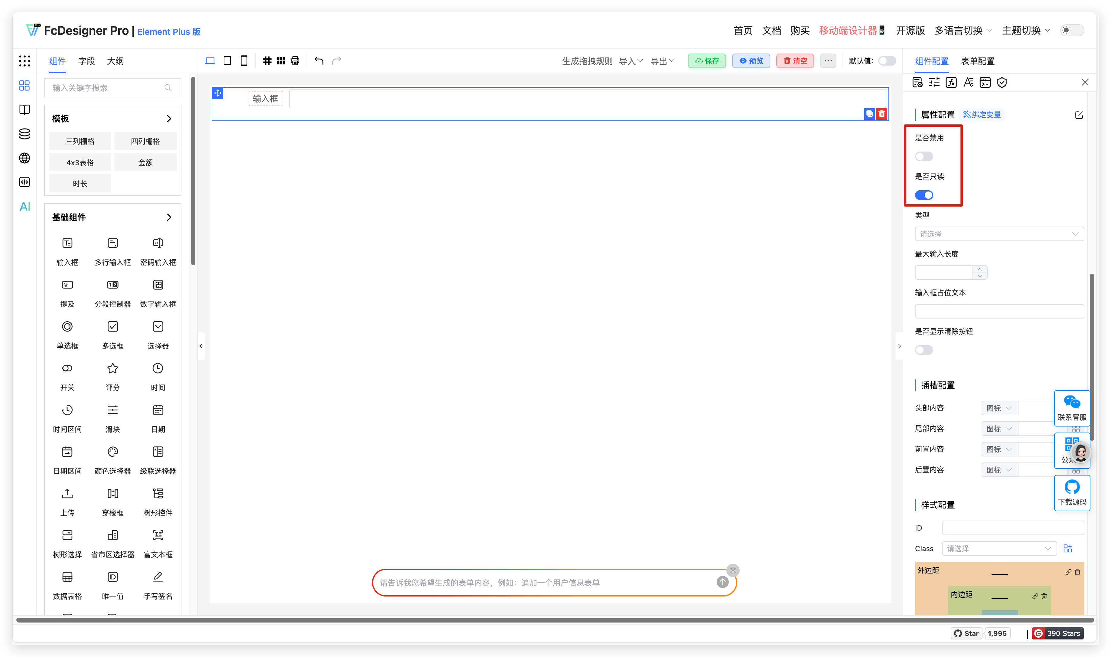
Disabled and Read-only
1. Overview
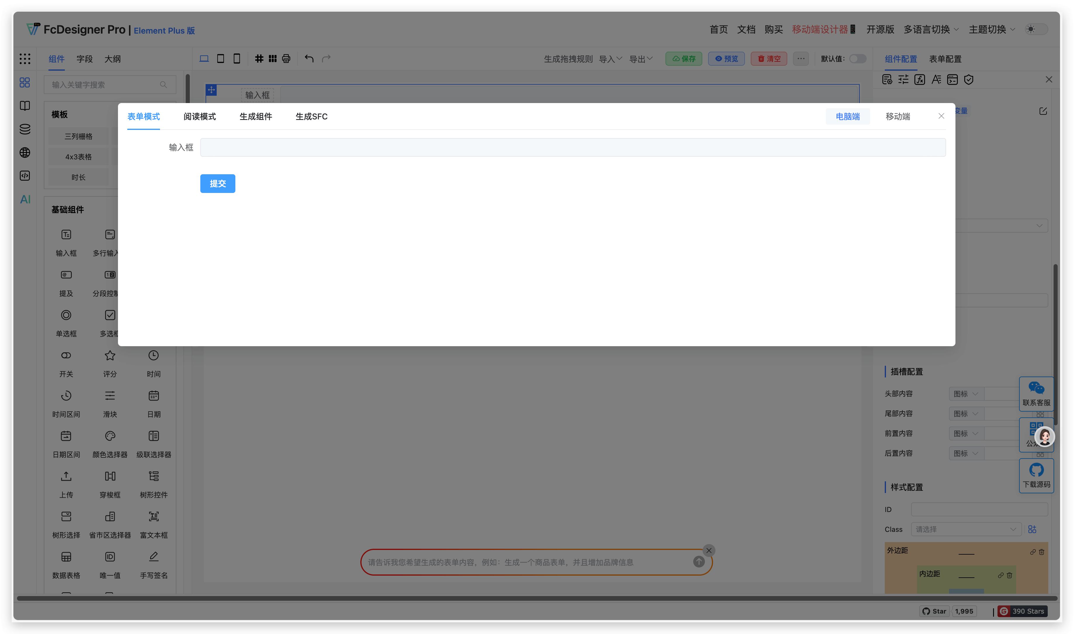
- Disabled State: Control field interactivity through boolean values. When disabled, the field appears gray and unclickable, preventing content modification.
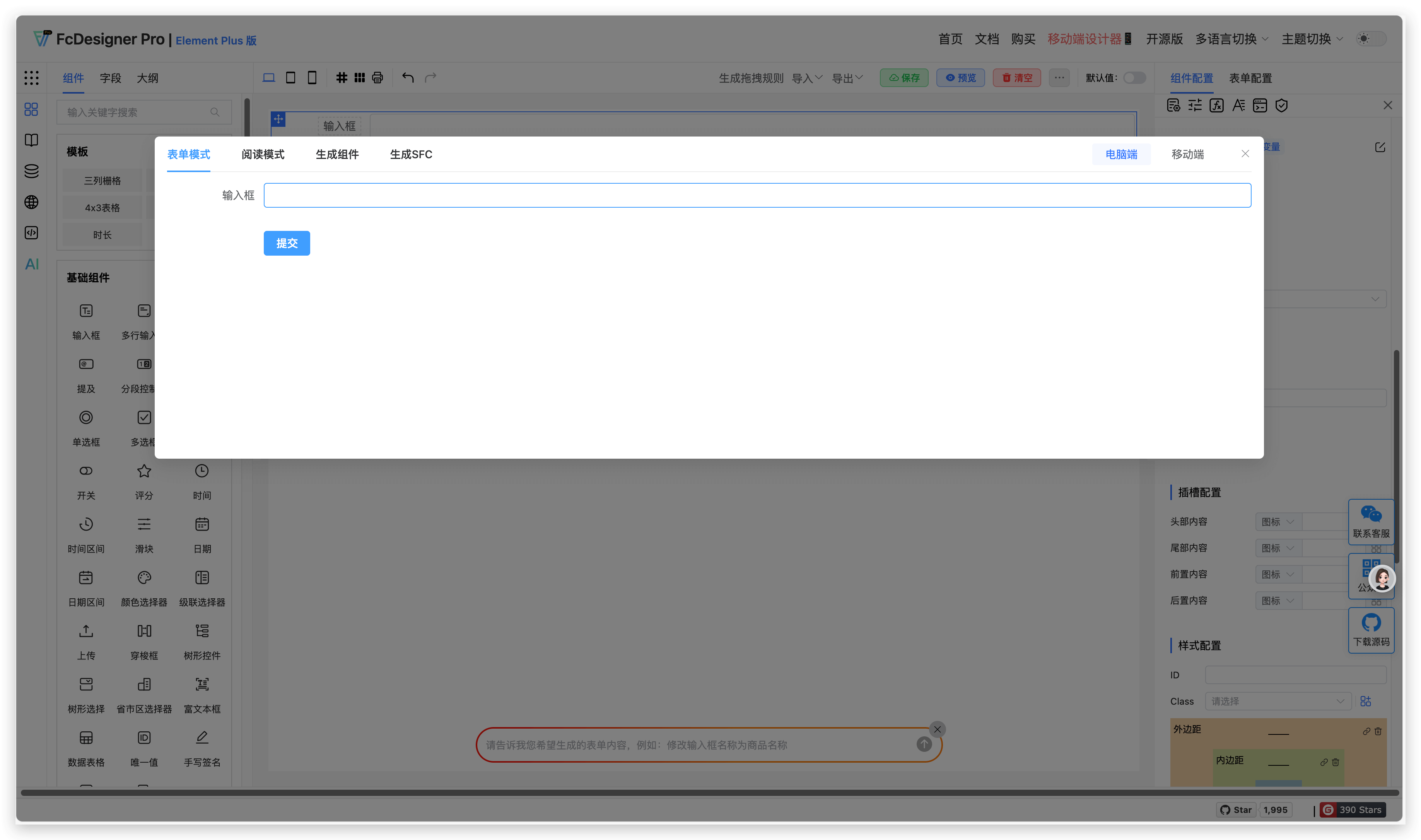
- Read-only Style: Field content is visible but not editable, usually retaining default style to distinguish from editable state.
2. Use Cases
Disabled:
- Prevent users from modifying submitted data after form submission.
- Dynamically disable fields based on business logic (e.g., disable submit button when agreement is not checked).
Read-only:
- Display system-generated or unmodifiable information (e.g., order number, creation time).
- Prohibit editing in preview mode, only allowing viewing.
3. Configuration Entry
Field disabled and read-only are set in "Component Configuration >> Property Configuration":
Field disabled effect is as follows:
Field read-only effect is as follows:
4. Supported Fields
Fields that support setting "Field Disabled" include: Input Box, Textarea, Password Input, Mention (does not support read-only style), Segmented Controller (does not support read-only style), Number Input (does not support read-only style), Radio Button (does not support read-only style), Checkbox, Select, Switch, Rating, Time, Time Range, Slider, Date, Date Range, Color Picker, Cascader, Upload, Transfer, Tree, Tree Select, Province-City-District Picker, Rich Text Editor, Handwritten Signature, Sub-form Selector, Sub-form, Group, Table Form, Nested Form, Infinite-Level Form, Button
Fields that support setting "Field Read-only" include: Input Box, Textarea, Password Input, Time, Time Range, Date, Date Range, Calculation Formula, Slot Area, Dynamic Area