


Module Overview
This document details the form designer's layout and functional divisions, including core modules such as the left sidebar, toolbar, design area, and right property panel, providing a complete form design solution.
1. Overall Layout
The designer adopts a standard three-column layout, including the left sidebar, middle design area, and right property panel, with a toolbar at the top. Each area has clear functions and works together to improve form design efficiency.
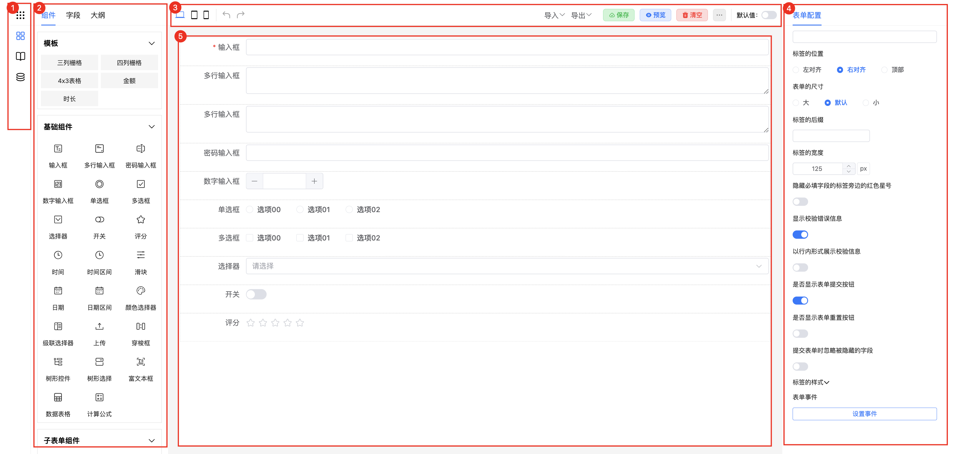
2. Left Sidebar
2.1 Left Sidebar
Provides core function switching entries, including:
- Form List
- Component List
- Dialog Management
- Global Data Management
2.2 Form List
Description: Manages business form templates and instances, supporting quick switching between different forms for editing.
Use Cases: In OA approval systems, preset commonly used form templates like leave requests and reimbursements, and quickly create template instances when needed.
2.3 Component List
Description: Provides rich form components and layout templates, supporting drag-and-drop to quickly build forms.
Use Cases:
- Basic Components: Input boxes, selectors, date pickers, and other basic fields
- Layout Components: Table layouts, column layouts, etc.
- Advanced Components: Rich text editors, file uploads, etc.
2.4 Dialog Management
Description: Design and manage dialog components in forms, supporting event-triggered display.
Use Cases: In order forms, clicking the "Select Product" button can trigger a product selection dialog, allowing users to quickly select product information.
2.5 Global Data
Description: Unified management of global behaviors, styles, data, and variables for cross-component sharing.
Use Cases: When multiple forms share the same style specifications or data sources, achieve unified management and maintenance through global configuration.
3. Toolbar
Provides common operation functions:
- Undo/Redo: Roll back and redo design steps
- Preview: View form effects in real-time
- Clear Form: Clear current form content with one click
- Default Value Settings: Configure initial values for form fields
- Import/Export: Import and export form configurations in JSON format
- Extension Functions: Plugin extensions for custom functions
4. Design Area
Description: Visual form design workspace, supporting various interactive operations.
Core Functions:
- Drag-and-Drop Layout: Freely drag components to build forms
- Component Operations: Supports copy, delete, adjust order, etc.
- Real-time Preview: WYSIWYG design experience
5. Right Property Panel
5.1 Form Configuration
Description: Set form global properties and behaviors.
Configuration Items:
- Form Title
- Submission Method
- Layout Style
- Responsive Settings
5.2 Form Events
Description: Configure form lifecycle events and interaction events.
Event Types:
- Load Events
- Submit Events
- Validation Events
- Custom Events