


Custom Input Placeholder Text
1. Overview
Display hint text when the input box is empty (e.g., "Please enter username") to guide users. Placeholder text automatically disappears when users start typing.
2. Use Cases
- Form Guidance: Clarify field purpose, reduce user confusion (such as search box hint "Search products…").
- Multi-language Support: Dynamically switch placeholder text based on user language.
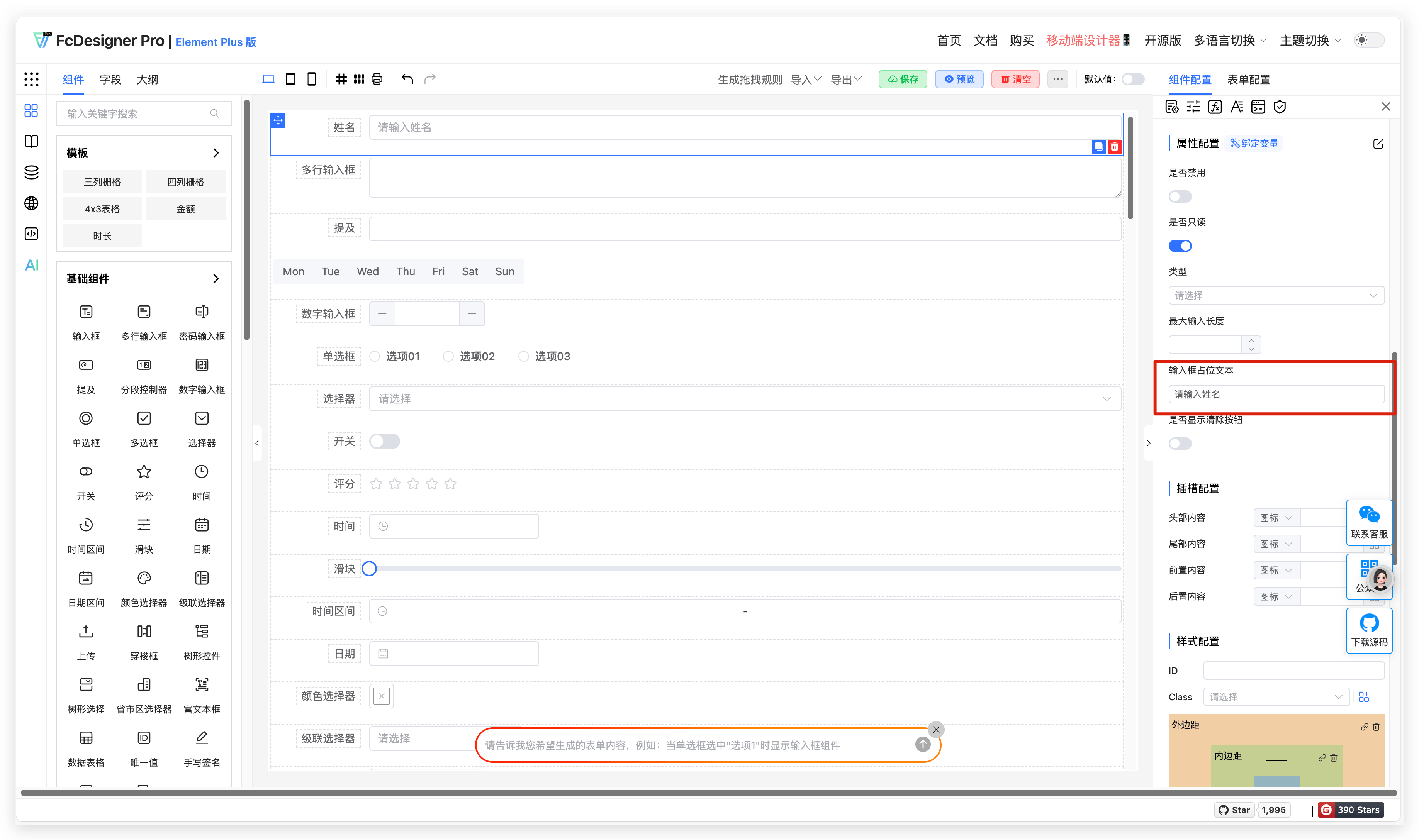
3. Configuration Entry
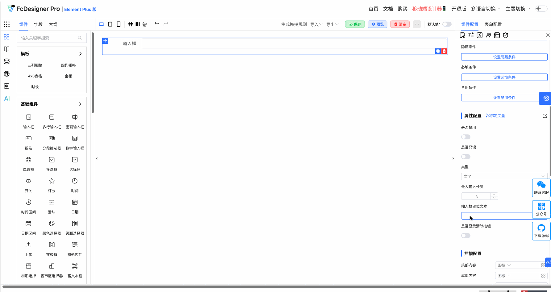
Custom input placeholder text is set in "Component Configuration >> Property Configuration":
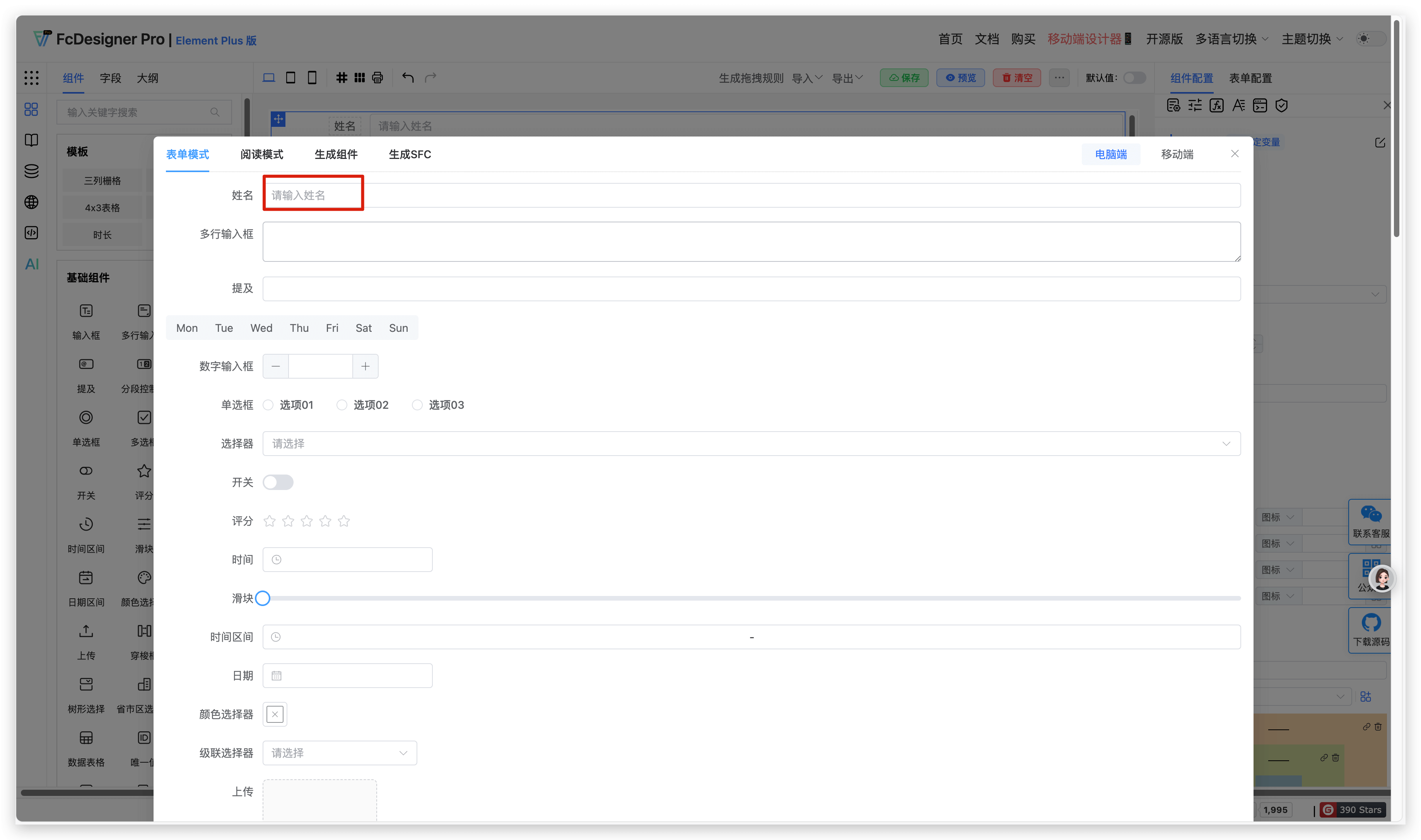
The placeholder text appears as follows:
4. Supported Fields
Only text box, textarea, mention, number input, select, time, time range, date, cascader, tree select, province-city-district picker, rich text editor, and sub-form selector support placeholder text settings.