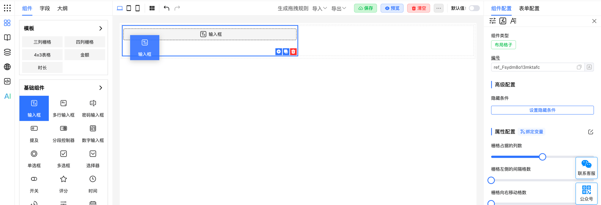
Extend Container Component
Container components let you nest other components, providing flexible layout options. This example shows how to define a Col container component and use it in the designer.
Before reading this article, see the Extend Components documentation to understand basic concepts.
Define Component
Define a simple Col container component that can accommodate other components and display a description message:

<template>
    <div class="col">
        <div>
            <slot></slot>
        </div>
        <span>Slot is the display area for dragged-in components</span>
    </div>
</template>
<script setup>
    import { defineProps } from 'vue';
    const props = defineProps({
        span: {
            type: Number,
            default: 12
        }
    });
</script>
<style scoped>
    .col {
        border: 1px solid #ddd;
        padding: 10px;
        box-sizing: border-box;
        position: relative;
    }
</style>- <slot></slot>: The slot is used to place dragged-in components.
- props: span property is used to control the container's width.
Import and Mount Custom Component
Import the custom component into FcDesigner and mount it:
// Import custom component
import Col from './Col.Vue';
import FcDesigner from '@form-create/designer';

// Mount custom component
FcDesigner.component('Col', Col);
// Or mount globally
app.component('Col', Col);
Define Component Drag Rule
Define a drag rule for the Col container component so it can be dragged and configured in the designer:
const colRule = {
    // Menu insertion position
    menu: 'layout',
    // Icon
    icon: 'icon-col',
    // Name
    label: 'Grid',
    // ID, must be unique!
    name: 'col',
    // Allow dragging components into it
    drag: true,
    // Whether component operation buttons are generated inside or outside the component
    inside: true,
    // Do not display mask, container components cannot display masks
    mask: false,
    // Generation rule
    rule() {
        return {
            type: 'Col',
            props: {span: 12},
            children: []
        };
    },
    // Property configuration rule
    props(_, {t}) {
        return [{
            type: 'slider',
            title: 'Width',
            field: 'span',
            // Default value
            value: 12,
            props: {min: 0, max: 24}
        }];
    }
};
Configuration Description
- menu: Defines the component's position in the left menu, set to layout here.
- icon: Icon for the component in the menu.
- label: Name of the component.
- name: Unique ID of the component.
- drag: Allows dragging this component.
- inside: Set to true, indicating that component operation buttons will be displayed inside the component.
- mask: Set to false, indicating that container components will not display a mask.
- rule: Component generation rule, including type, properties, and child components.
- props: Defines the component's property configuration items, using a slider component here to adjust the width (span).
Mount Component Drag Rule
// Mount drag rule
this.$refs.designer.addComponent(colRule);
Following these steps, you can create container components and add them to the designer. This lets you manage and layout components more efficiently. For more complex functionality or styles, extend and customize the component as needed.


