


Extend Component
Integrate custom components into the designer to extend functionality. This guide shows how to create and use custom components.
View built-in form components and configurable parameters in the Renderer Documentation.
See Custom Form Components for development specifications and requirements.
View more component drag configuration rules in the Source Code.
Note
Global drag rule registration is supported through FcDesigner.addDragRule, enabling one-time configuration for use in multiple places. Method Documentation
Extend Component Tutorial
Step-by-step guide to creating a Title component that displays various title texts in forms.
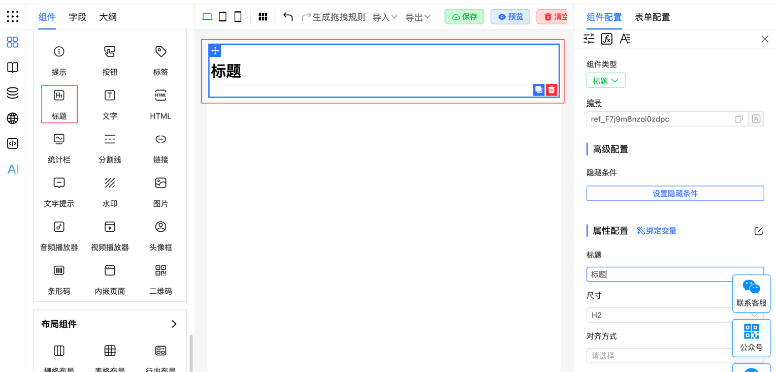
1. Package Component
Create a new Title.vue file with component functionality and styles:
<template>
    <div class="_fc-title" :class="size || 'h2'" :style="textStyle">
        {{ title }}
    </div>
</template>
<script>
    import {defineComponent} from 'vue';
    export default defineComponent({
        name: 'FcTitle',
        data() {
            return {};
        },
        props: {
            title: String,
            size: String,
            align: String,
        },
        computed: {
            textStyle() {
                return {
                    textAlign: this.align || 'left',
                }
            }
        }
    });
</script>
<style>
    ._fc-title {
        width: 100%;
        font-size: 16px;
        font-weight: 600;
        margin-top: 1em;
        margin-bottom: 16px;
    }

    ._fc-title.h1, ._fc-title.h2 {
        padding-bottom: .3em;
        border-bottom: 1px solid #eee
    }

    ._fc-title.h1 {
        font-size: 32px;
        line-height: 1.2
    }

    ._fc-title.h2 {
        font-size: 24px;
        line-height: 1.225
    }

    ._fc-title.h3 {
        font-size: 20px;
        line-height: 1.43
    }

    ._fc-title.h4 {
        font-size: 16px;
    }

    ._fc-title.h5 {
        font-size: 14px;
    }

    ._fc-title.h6 {
        font-size: 12px;
    }
</style>
2. Mount Component
Mount the Title component in main.js
import Title from 'Title.vue'
import FcDesigner from '@form-create/designer'

FcDesigner.component('Title', Title);
// Or mount globally through app
app.component('Title', Title);
Or mount the Title component in a component
<script>
    import {defineComponent} from 'vue';
    import Title from 'Title.vue';
    import FcDesigner from '@form-create/designer'
    export default defineComponent({
        mounted() {
            FcDesigner.component('Title', Title);
        }
    });
</script>
3. Define Drag Rule
Define the drag rule for the Title component
const titleDragRule = {
    menu: 'aide',
    icon: 'icon-title',
    label: 'Title',
    // Unique ID
    name: 'title',
    // Events that can be configured for the component
    event: ['click'],
    rule() {
        // Component rendering rule
        return {
            // Component name, corresponding to the previous step
            type: 'Title',
            props: {
                title: 'Custom Title',
            },
        };
    },
    props() {
        // Configuration items on the right side of the component, corresponding to props in the component
        return [
            {type: 'input', field: 'title', title: 'Title'},
            {
                type: 'select',
                field: 'size',
                title: 'Size',
                // Default value
                value: 'H2',
                options: [1, 2, 3, 4, 5, 6].map(k => {
                    return {label: 'H' + k, value: 'h' + k};
                })
            }, {
                type: 'select',
                field: 'align',
                title: 'Position',
                options: [
                    {label: 'Left', value: 'left'},
                    {label: 'Center', value: 'center'},
                    {label: 'Right', value: 'right'}
                ]
        }];
    }
};
View built-in form components and configurable parameters in the Renderer Documentation.
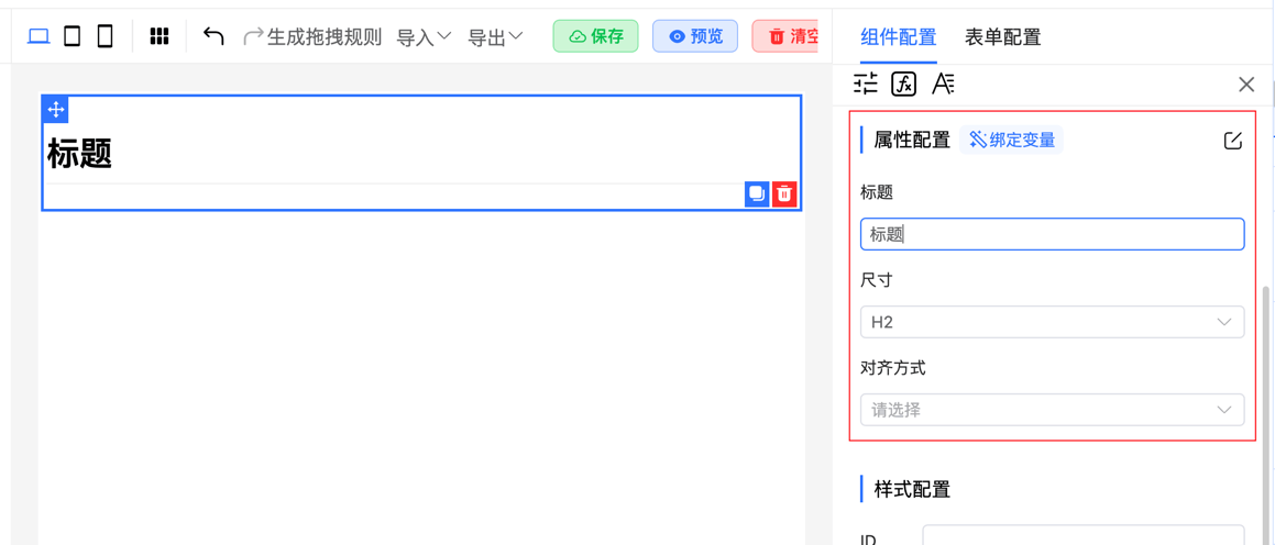
The configuration panel on the right is automatically generated based on the rules defined in the props function.
4. Import Drag Rule
Mount the drag rule to the designer:
// Assume this is your Vue component
export default {
    mounted() {
        // Mount drag rule
        this.$refs.designer.addComponent(titleDragRule);
    }
};
These steps let you integrate custom components with the designer and define their drag behavior and property configurations.
Extend Form Component Tutorial
Custom form components implement business-specific form controls. This section covers how to define and use them, including importing, mounting, and setting drag rules.
See Custom Form Components for development specifications and requirements.
1. Package Component
Step-by-step guide to developing a custom input component based on Element Plus Input.
Create a new Input.vue file:
<template>
    <el-input :disabled="disabled" :modelValue="modelValue" @update:modelValue="handleChange" v-bind="$attrs">
        <!-- Custom component slot -->
        <template #prepend>Http://</template>
    </el-input>
</template>
<script>
    import {defineComponent} from 'vue';
    export default defineComponent({
        name: 'FcInput',
        data() {
            return {};
        },
        emits: ['update:modelValue', 'change'],
        props: {
            // Get form data
            modelValue: String,
            // Support form disabled functionality
            disabled: Boolean
        },
        methods: {
            // Update form data
            handleChange(val) {
                this.$emit('update:modelValue', val);
                // Trigger change event
                this.$emit('change', val);
            }
        }
    });
</script>
Using v-bind="$attrs" automatically passes all configuration items to el-input, inheriting all properties without redefining them.
2. Mount Component
Mount the Input component in main.js
import Input from 'Input.vue'
import FcDesigner from '@form-create/designer'

FcDesigner.component('FcInput', Input);
// Or mount globally through app
app.component('FcInput', Input);
Or mount the Input component in a component
<script>
    import {defineComponent} from 'vue';
    import Input from 'Input.vue';
    import FcDesigner from '@form-create/designer'
    export default defineComponent({
        mounted() {
            FcDesigner.component('FcInput', Input);
        }
    });
</script>
3. Define Drag Rule
Define the drag rule for the Input component
import uniqueId from '@form-create/utils/lib/unique';
const InputDragRule = {
    menu: 'main',
    icon: 'icon-input',
    label: 'Custom Input',
    // Unique ID
    name: 'FcInput',
    // Form component identifier
    input: true,
    // Component events
    event: ['blur', 'focus', 'change', 'input', 'clear'],
    validate: ['string', 'url', 'email'],
    rule({t}) {
        return {
            // Component name, corresponding to the previous step
            type: 'FcInput',
            field: uniqueId(),
            title: 'Custom Input',
            info: '',
            $required: false,
            props: {}
        };
    },
    props() {
        return [
            {
                type: 'switch',
                title: 'Disabled',
                field: 'disabled'
            },
            {
                type: 'switch',
                title: 'Clearable',
                field: 'clearable'
            },
            {
                type: 'input',
                title: 'Placeholder',
                field: 'placeholder'
            },
        ];
    }
};
export default InputDragRule;
View built-in form components and configurable parameters in the Renderer Documentation.
Note: To use uniqueId, install the @form-create/utils package, or implement custom logic to generate unique IDs starting with a letter (no symbols allowed).
npm install @form-create/utils@^34. Import Drag Rule
Mount the drag rule to the designer:
// Assume this is your Vue component
export default {
    mounted() {
        // Mount drag rule
        this.$refs.designer.addComponent(InputDragRule);
    }
};
props Configuration Name Mapping Rules
If field starts with formCreate in the component configuration rule (props) method, the system automatically maps it to the corresponding field in the rule.
| Field | Description |
|---|---|
| type | Modifies the rule.props.type field |
| options>label | Modifies the rule.props.options.label field |
| formCreateStyle | Modifies the rule.style field |
| formCreateStyle>width | Modifies the rule.style.width field |
| formCreateChild | Modifies rule.children[0] |
For example:
{
    props() {
        return [
            {
                type: 'switch',
                title: 'Disabled',
                // Configuration name, modifies rule.props.disabled
                field: 'disabled'
            },
            {
                type: 'switch',
                title: 'Clearable',
                // Configuration name, modifies rule.props.clearable
                field: 'clearable'
            },
            {
                type: 'input',
                title: 'Placeholder',
                // Configuration name, modifies rule.props.placeholder
                field: 'placeholder'
            },
        ];
    }
}
More Examples
Restrict to Only One Drag-in
const InputDragRule = {
    menu: 'main',
    icon: 'icon-input',
    label: 'Custom Input',
    name: 'FcInput',
    // Only one can be dragged in
    only: true,
    //...
}
Restrict to Only Drag into Group Component
const InputDragRule = {
    menu: 'main',
    icon: 'icon-input',
    label: 'Custom Input',
    name: 'FcInput',
    // Restrict to only drag into group component
    allowDragTo: ['group'],
    //...
}
Inline Component
Inline components don't automatically expand to 100% width:
const InputDragRule = {
    menu: 'main',
    icon: 'icon-input',
    label: 'Custom Input',
    name: 'FcInput',
    // Inline component identifier
    inline: true,
    //...
}
Define Multi-language IDs Needed by Component
const InputDragRule = {
    menu: 'subform',
    icon: 'icon-table-form',
    label: 'Table Form',
    name: 'tableForm',
    input: true,
    mask: false,
    subForm: 'array',
    // Multi-language ID
    languageKey: ['add', 'operation', 'dataEmpty'],
    //...
}
Disable Component Style Configuration
const InputDragRule = {
    menu: 'main',
    icon: 'icon-input',
    label: 'Custom Input',
    name: 'FcInput',
    // Disable component style configuration
    style: false,
    //...
}
Transform Component Rule
For example, the sub-form rules of the group component are actually stored in props.rule, but are displayed in the children field for visual design convenience. In this case, bidirectional data transformation adaptation is needed.
const InputDragRule = {
    menu: 'main',
    icon: 'icon-input',
    label: 'Custom Input',
    name: 'FcInput',
    // When loading designer rendering rules
    loadRule(rule) {
        rule.children = rule.props.rule || [];
        rule.type = 'FcRow';
        delete rule.props.rule;
    },
    // Triggered when exporting final rendering rules
    parseRule(rule) {
        rule.props.rule = rule.children;
        rule.type = 'group';
        delete rule.children;
        delete rule.props.mode;
    },
    //...
}
Data Structure
interface DragRule {
    // Component ID, must be unique
    name: string;
    // Component name
    label: string;
    // Component icon
    icon: string;
    // Insertion category
    menu?: MenuName;
    // Whether style configuration is supported
    style?: boolean;
    // Whether it's an inline component
    inline?: boolean;
    // Whether it's a form component
    input?: boolean;
    // Control maximum number of child components that can be dragged in
    maxChildren?: number;
    // If it's a sub-form component, need to define the type of `value`
    subForm?: 'object' | 'array';
    // List of draggable components (available for container components)
    allowDrag?: AllowDrag;
    // List of non-draggable components (available for container components)
    denyDrag?: DenyDrag;
    // Components into which this component can be dragged
    allowDragTo?: string | string[];
    // Component, not recommended
    component?: Component;
    // List of rendered child components
    subRender: ({h, resolveComponent, subRule, rule}: {
        h: typeof H<any>,
        resolveComponent: typeof ResolveComponent,
        subRule: Rule,
        rule: Rule
    }) => Array<{
        label: string;
        vnode: VNode
    }>;
    // Configure component condition selection method
    condition: conditionComponentType | ((rule: Rule) => ({
        // Component type
        type: conditionComponentType;
        // Selection options
        options?: any[];
        // Component type
        props?: Object;
    }));
    // Multi-language configuration items
    languageKey: string[];
    // Form global configuration
    formOptions?: {
        globalClass?: GlobalClass;
        globalVariable?: GlobalVariable;
        globalData?: GlobalData;
        globalEvent?: GlobalEvent;
        language?: Object;
        style?: string;
    } | string;
    // Component generation rule
    rule(arg: { t: t }): Rule;
    // Component property configuration rule
    props(rule: Rule, arg: { t: t, api: Api }): Rule[];
    // Convert to final rule when exporting rules through this method
    parseRule?: (rule: Rule) => void;
    // Convert to designer rendering rule when importing rules through this method
    loadRule?: (rule: Rule) => void;
    // Triggered when fields in props change
    watch?: {
        [key: string]: (arg: { value: any, rule: Rule, api: Api, field: string }) => void;
    };
    // Whether there are matching child components, e.g., Row and Col
    children?: string;
    // Number of child components to render during initialization
    childrenLen?: number;
    // Whether the current component's operation container is displayed inside the component. When false, the operation container wraps the current component
    inside?: true | boolean;
    // Whether other components can be dragged into the current component
    drag?: true | string | boolean;
    // Whether to display drag button
    dragBtn?: false | boolean;
    // Control whether operation buttons are displayed and which ones
    handleBtn?: true | boolean | Array<'create' | 'copy' | 'addChild' | 'delete'>;
    // Hide fields in basic configuration
    hiddenBaseField?: string[];
    // Whether to display mask to avoid component operations. Recommended true when there are child components, false otherwise
    mask?: false | boolean;
    // Whether only one can be dragged in
    only?: boolean;
    // Whether to generate name
    aide?: boolean;
    // Current component's slots
    easySlots?: Array<string| {
        // Slot name
        value: string;
        // Slot description
        label?: string;
        // Type
        type?: 'icon' | 'text'
    }>;
    // Events supported by current component
    event?: string[];
    // Data type of current component's `value`. When 'required', only display whether it's required
    validate?: string[] | 'required' | boolean;
}