


Extend Templates
Custom templates help you quickly create commonly used component combinations or layouts. Define custom templates to drag multiple components at once, simplifying development.
This feature is only available in the Pro version of the designer. Learn more about Pro version features
Data Structure
// Drag template description rule
export interface DragTemplateRule {
    // Fixed
    menu: 'template';
    // Template ID, must be unique
    name: string;
    // Template name
    label: string;
    // Whether only one can be dragged in
    only?: boolean;
    // Whether to automatically replace field names in rules. Recommended as true when multiple instances may exist in the form
    autoField?: false | boolean;
    // Form global configuration, automatically imported after dragging in components
    formOptions?: {
        // Global style configuration
        globalClass?: GlobalClass;
        // Global variable configuration
        globalVariable?: GlobalVariable;
        // Global data source configuration
        globalData?: GlobalData;
        // Global event configuration
        globalEvent?: GlobalEvent;
        // Multi-language configuration
        language?: Object;
        // Global style
        style?: string;
    } | string;
    // Template rendering rules, or JSON rules, or function that returns JSON rules
    template: Rule[] | string | ((arg: { t: t }) => string);
}
Define Template Drag Rule
When creating a custom template, define a rule object containing the template's basic information and generation rules. Example: define a template that generates a three-column grid:
const ColTemplateRule = {
    // Menu insertion position, fixed as template
    menu: 'template',
    // ID, must be unique!
    name: 'col3',
    // Template name
    label: 'Three-Column Grid',
    // Whether to automatically replace field names in rules. Recommended as true when multiple instances may exist in the form. Only supports auto-generated field IDs!
    autoField: false,
    // Whether only one can be dragged in
    only: false,
    // Component generation rules, you can place JSON rules designed in the designer here
    template: [
        {
            type: 'fcRow',
            children: [
                {
                    type: 'col',
                    props: {
                        span: 8
                    },
                    display: true,
                    hidden: false,
                    _fc_drag_tag: 'col'
                },
                {
                    type: 'col',
                    props: {
                        span: 8
                    },
                    display: true,
                    hidden: false,
                    _fc_drag_tag: 'col'
                },
                {
                    type: 'col',
                    props: {
                        span: 8
                    },
                    display: true,
                    hidden: false,
                    _fc_drag_tag: 'col'
                }
            ],
            display: true,
            hidden: false,
            _fc_drag_tag: 'fcRow'
        }
    ]
};
Description
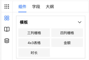
- menu: template - Template appears in the template menu
- name: col3 - Unique identifier for the template
- label: Three-Column Grid - Display name of the template
- autoField: false - Field names won't be automatically replaced
- only: false - Multiple instances can be dragged
- template: - Array containing component generation rules defining components and layout
Mount Drag Rule
Mount the custom template to the designer:
// Assume this is your Vue component
export default {
    mounted() {
        // Mount drag rule
        this.$refs.designer.addComponent(ColTemplateRule);
    }
};
Template Packaging Tutorial
Package a Select dropdown component with city search functionality:
1. Design Rules
Clear the design area, create a new Select component, and add city search functionality.
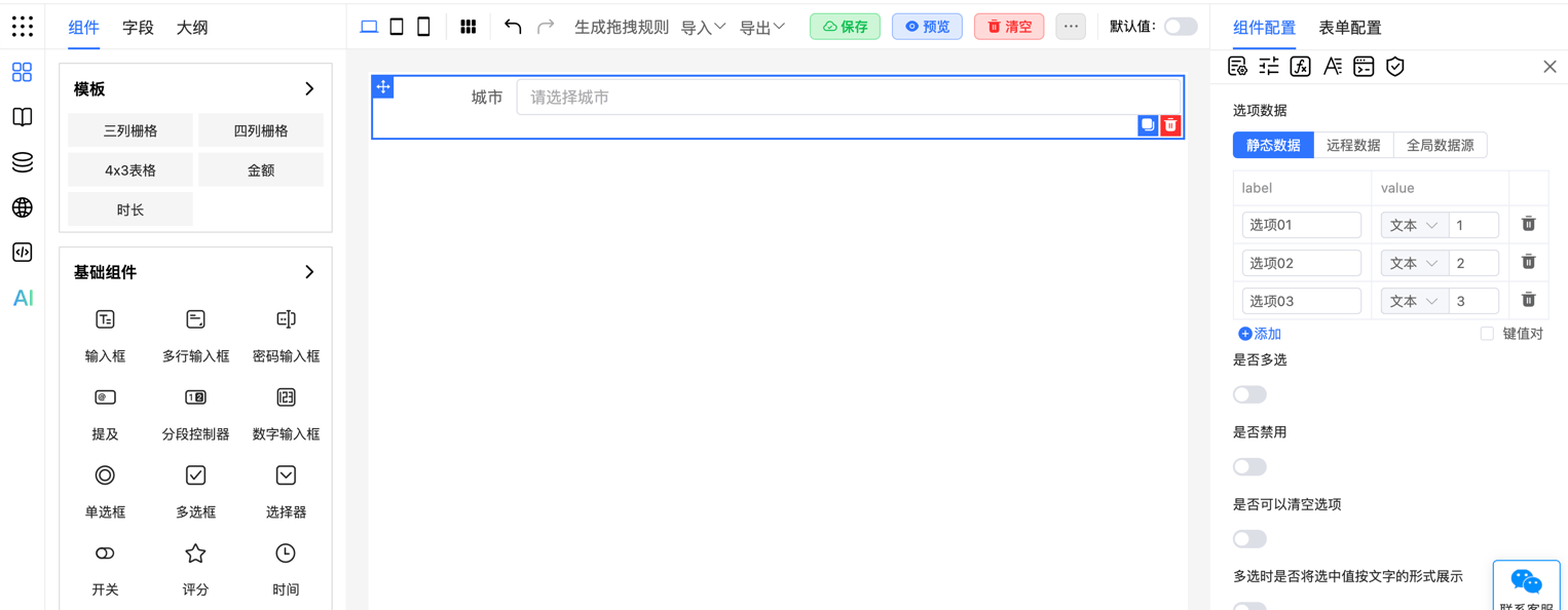
2. Get Rules
Get component configuration rules from the right-side JSON panel or by calling designer.getJson():
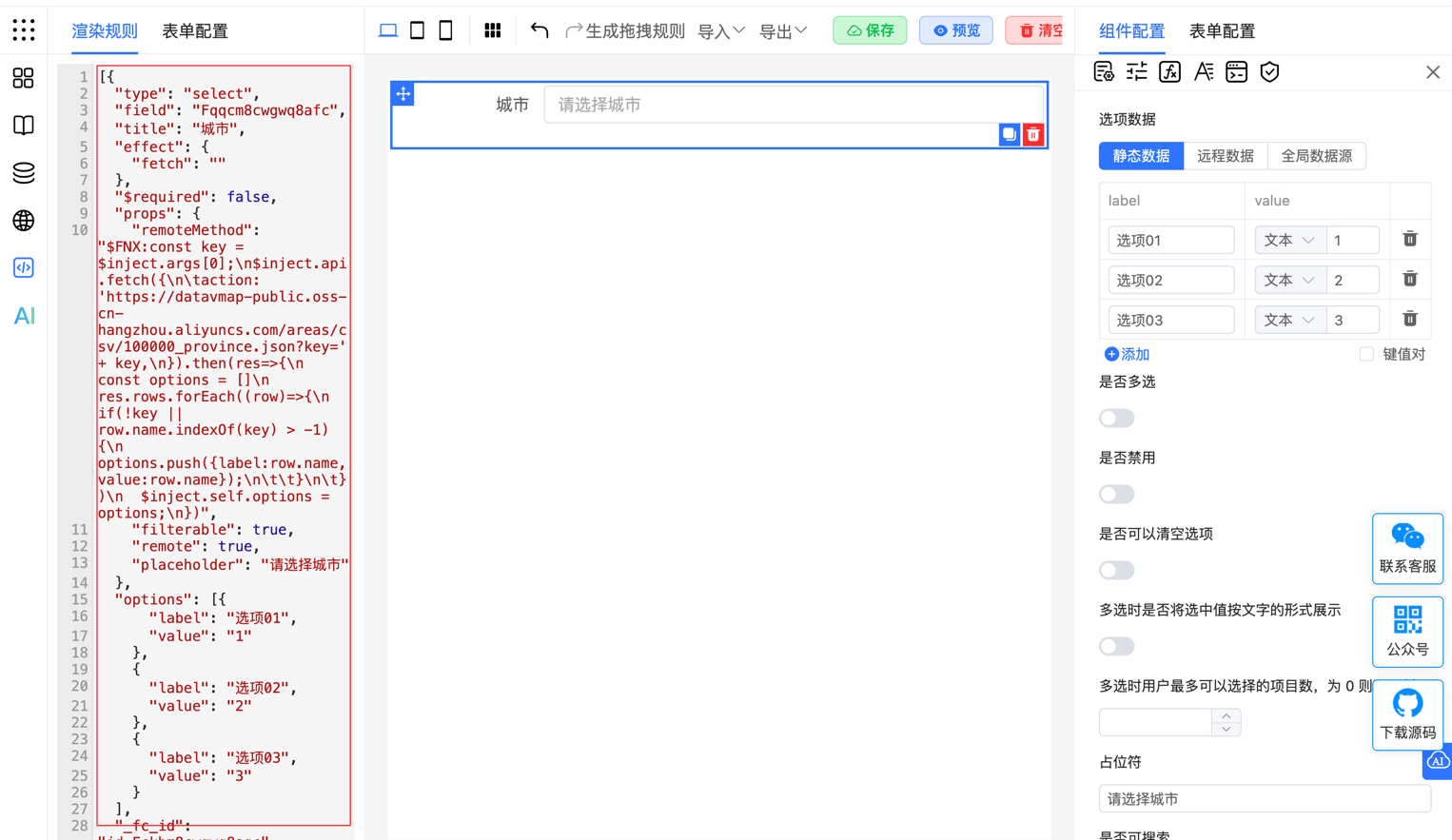
Get rules through the designer.getJson() method
<template>
    <fc-designer ref="designer"/>
</template>
<script setup>
    const designer = ref(null);
    // Get current rules
    function getRule(){
        const json = designer.value.getJson();
        console.log(json);
    }
</script>
3. Define Drag Rule
Create a new cityTemplate.js file to store drag configuration rules for the city selection component:
const CityTemplate = {
    // Menu insertion position, fixed as template
    menu: 'template',
    // ID, must be unique!
    name: 'cityTemplate',
    // Template name
    label: 'City',
    // Component generation rules, you can place JSON rules designed in the designer here
    template: "[{\"type\":\"select\",\"field\":\"Fqqcm8cwgwq8afc\",\"title\":\"City\",\"effect\":{\"fetch\":\"\"},\"$required\":false,\"props\":{\"remoteMethod\":\"$FNX:const key = $inject.args[0];\\n$inject.api.fetch({\\n\\taction: 'https://datavmap-public.oss-cn-hangzhou.aliyuncs.com/areas/csv/100000_province.json?key=' + key,\\n}).then(res=>{\\n  const options = []\\n  res.rows.forEach((row)=>{\\n    if(!key || row.name.indexOf(key) > -1){\\n      options.push({label:row.name,value:row.name});\\n\\t\\t}\\n\\t})\\n  $inject.self.options = options;\\n})\",\"filterable\":true,\"remote\":true,\"placeholder\":\"Please select a city\"},\"options\":[{\"label\":\"Option 01\",\"value\":\"1\"},{\"label\":\"Option 02\",\"value\":\"2\"},{\"label\":\"Option 03\",\"value\":\"3\"}],\"_fc_id\":\"id_Fckbm8cwgwq8agc\",\"name\":\"ref_Fa3mm8cwgwq8ahc\",\"_fc_drag_tag\":\"select\",\"display\":true,\"hidden\":false}]"
}

export default CityTemplate;
4. Import Drag Rule
Use addComponent to import the city template configuration:
<template>
    <fc-designer ref="designer"/>
</template>
<script setup>
    import {onMounted} from "vue";
    const designer = ref(null);
    // Note: Must wait for component initialization to complete before calling its methods
    onMounted(() => {
        designer.value.addComponent(CityTemplate);
    });
</script>
More Examples
Example 1: Multi-Component Combination
Use a number input to enter values, automatically converting to Chinese uppercase amount display through a value component:
const chineseAmountTemplate = {
    menu: 'template',
    name: 'chineseAmount',
    label: 'Chinese Amount',
    template: [
        {
            type: 'inputNumber',
            field: 'Fgtxlugfgbdvb5c',
            title: 'Amount',
            info: '',
            $required: false,
            display: true,
            hidden: false,
            _fc_drag_tag: 'inputNumber'
        },
        {
            type: 'fcValue',
            field: 'Fvr1lugfgd3yb7c',
            title: ' ',
            info: '',
            display: true,
            hidden: false,
            _fc_drag_tag: 'fcValue',
            style: {
                color: '#999999'
            },
            computed: {
                value: '"Uppercase: " + TOCHINSESAMOUNT(Fgtxlugfgbdvb5c || 0)'
            }
        }
    ]
}
Example 2: Single Component Template
Encapsulate an input field as a functional component with unit display (e.g., amount input showing "Yuan" suffix):
const UnitTemplate = {
    menu: 'template',
    name: 'UnitTemplate',
    label: 'Amount',
    template: [
        {
            "type": "input",
            "field": "Fpq4m8nxdq6fdbc",
            "title": "Amount",
            "$required": false,
            "_fc_id": "id_F3tam8nxdq6fdcc",
            "name": "ref_Fywjm8nxdq6fddc",
            "$easySlots": {
                "suffix": {
                    "type": "text",
                    "value": "Yuan"
                }
            },
            "display": true,
            "hidden": false,
            "_fc_drag_tag": "input"
        }
    ]
}
Example 3: Associate Global Configuration
Select template supporting global data source and multi-language, automatically loading options and adapting to different languages:
const StaffTemplate = {
    menu: 'template',
    name: 'StaffTemplate',
    label: 'Staff',
    formOptions: {
        language: {
            "zh-cn": {
                "AMw2a0kE": "人员"
            },
            "en": {
                "AMw2a0kE": "Staff"
            }
        },
        globalData: {
            "data_Ffa5m8nyi67vdnc": {
                "label": "Load Data",
                "type": "fetch",
                "action": "/api/xxx",
                "method": "GET",
                "dataType": "json",
                "headers": {},
                "query": {},
                "data": [],
                "parse": "",
                "onError": ""
            }
        },
    },
    template: [{
        "type": "select",
        "field": "Ffrsm8nyhvgsdkc",
        "title": "{{$t.AMw2a0kE}}",
        "effect": {
            "fetch": {
                "to": "options",
                "key": "data_Ffa5m8nyi67vdnc",
                "_uni": 1
            }
        },
        "$required": false,
        "props": {
            "_optionType": 1
        },
        "_fc_id": "id_F2q2m8nyhvgsdlc",
        "name": "ref_Frlsm8nyhvgsdmc",
        "display": true,
        "hidden": false,
        "_fc_drag_tag": "select"
    }]
}
Example 4: Dynamically Generate Template
Generate different form templates based on different business scenarios using configuration objects:
const FormTemplateRule = (config) => {
    return {
        menu: 'template',
        name: 'form-template',
        label: 'Dynamic Form Template',
        template: [
            {
                type: 'fcRow',
                children: config.fields.map(field => ({
                    type: field.type,
                    props: field.props,
                    display: true,
                    hidden: false,
                    _fc_drag_tag: field.type
                })),
                display: true,
                hidden: false,
                _fc_drag_tag: 'fcRow'
            }
        ]
    };
};

// Configuration object example
const formConfig = {
    fields: [
        { type: 'input', props: { placeholder: 'Please enter name' } },
        { type: 'select', props: { options: [{ label: 'Option 1', value: '1' }, { label: 'Option 2', value: '2' }] } }
    ]
};

// Mount template
export default {
  mounted() {
    const formTemplate = FormTemplateRule(formConfig);
    this.$refs.designer.addComponent(formTemplate);
  }
};
Application Scenarios
- Common layouts: Define templates for commonly used grid or form layouts to quickly drag out layout components
- Business components: Encapsulate business logic components like cards, lists, etc., for quick insertion via custom templates
- Complex component combinations: Build complex combinations like nested form components quickly through custom templates
Custom templates make the designer more flexible and powerful. Define and mount templates to quickly generate commonly used component combinations and layouts. Dynamic template generation and configuration objects enhance template applicability and flexibility.