


Component Linkage
Implement component linkage in forms—for example, showing or hiding components based on input values. FormCreate provides component linkage functionality to control component states like display, disabled, and required through the control configuration option.
Note
In the Pro version, use data linkage and logical condition configuration instead of the basic component linkage solution. Detailed Documentation.
Data Structure
type Control =  Array<{
  // Control through built-in conditions, mutually exclusive with `handle`
  value?: any;
  // Built-in conditions, can be combined with `value`
  condition?: '==' | '!=' | '<>' | '>' | '>=' | '<' | '<=' | 'in' | 'notIn' | 'on' | 'notOn' | 'between' | 'notBetween' | 'empty' | 'notEmpty';
  // Custom control condition
  handle?: (val: any, api: Api) => boolean;
  // Control the display, disabled, required state of corresponding rules. Default value is if
  method?: 'if' | 'enabled' | 'required';
  // Controlled fields (corresponding component field IDs or identifiers)
  rule: string[];
}>
Note: Component values must be strictly equal to value (including complete data type consistency).
method Options
| Key | Configuration | Description |
|---|---|---|
| if | Conditional Rendering | Control component's show/hide state |
| required | Required Validation | Set whether field is required |
| disabled | Disabled State | Control whether component is interactive |
condition Options
| Key | Operator | Description | Value Type | Example |
|---|---|---|---|---|
| == | Strict Equal | Component value exactly equals value | Any | value: 10 |
| != | Not Equal | Component value does not equal value | Any | value: "error" |
| <> | Not Equal | Component value does not equal value (same as !=) | Any | value: false |
| > | Greater Than | Component value is greater than value | Number | value: 100 |
| >= | Greater Than or Equal | Component value is greater than or equal to value | Number | value: 18 |
| < | Less Than | Component value is less than value | Number | value: 0 |
| <= | Less Than or Equal | Component value is less than or equal to value | Number | value: 100 |
| in | Contains | Component value exists in value array | Array | value: [1,2,3] |
| notIn | Does Not Contain | Component value does not exist in value array | Array | value: ["a","b"] |
| on | Contains Value | value exists in component value (array) | String | Number |
| notOn | Does Not Contain Value | value does not exist in component value (array) | String | Number |
| between | Within Range | Component value is between value[0] and value[1] | Array[2] | value: [10,20] |
| notBetween | Outside Range | Component value is not between value[0] and value[1] | Array[2] | value: [0,100] |
| empty | Empty | Pass validation when component value is empty | - | value: true |
| notEmpty | Not Empty | Pass validation when component value is not empty | - | value: true |
| pattern | Regular Expression | Validate component value with regular expression | String | value:'^1\d{10}$' (no "/" before and after) |
Linkage Example
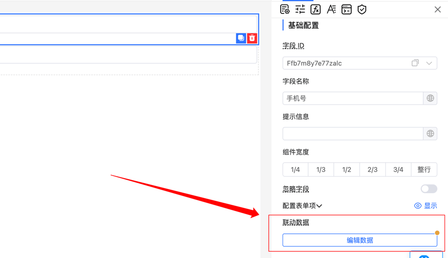
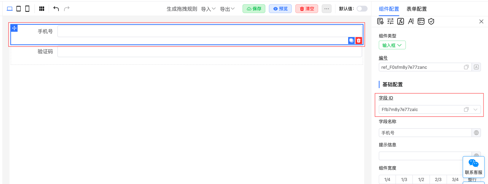
Implement linkage display between phone number (Ffb7m8y7e77zalc) and verification code (Ffa7m8y7eu9eaoc) fields: only show the verification code input when the phone number input is not empty.
Configure linkage rules in linkage data:
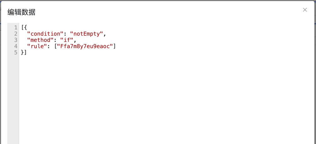
Note: Configure strictly according to the specified data type, otherwise it will trigger content syntax error prompts.
More Examples
Control Component Display State
Control the display state of specific fields (e.g., field1, field2) through configuration rules. When the condition is met (e.g., value is '1'), these fields are dynamically shown or hidden:
[{
    value: '1',
    rule: ['field1', 'field2']
}]
Control Component Disabled State
Control the disabled state of specific components (e.g., field1, name2) through configuration rules. When the condition is met (e.g., value is '1'), these fields are dynamically enabled or disabled:
[{
    value: '1',
    method: 'disabled',
    rule: ['field1', 'name2']
}]
Control Component Required State
Control the required state of specific fields (e.g., field1) through configuration rules. When the condition is met (e.g., value is '1'), the required validation rule is dynamically set or removed:
[{
    value: '1',
    method: 'required',
    rule: ['field1']
}]
Calculate Component Display State
Use custom functions to control field display conditions. The handle method determines if the field value is 'ok' or 'no', dynamically controlling the show/hide state:
[{
  "handle": function(val, api) {
    return val === 'ok' || val === 'no';
  },
  "method": "if",
  "rule": ["Ffa7m8y7eu9eaoc"]
}]